
UniWrap24: Denver Broncos 2024 Uniforms Review

Four teams redesigned their uniforms for the 2024 season: New York Jets, Detroit Lions, Houston Texans and Denver Broncos. This short series will review all the uniforms worn by those four teams. We conclude the series today, with our own Kary Klismet tackling his home team. Enjoy! — PH
by Kary Klismet
I’m a lifelong Broncos fan, and I like to think of myself as a keen observer and historian of their uniforms. So I was honored when Phil asked me to do an assessment of Denver’s new uniform program.
After 27 years in their previous uni set, a uniform refresh was warranted for the Broncos. These new uniforms accomplished that fairly well, with a few exceptions I’ll get into below.
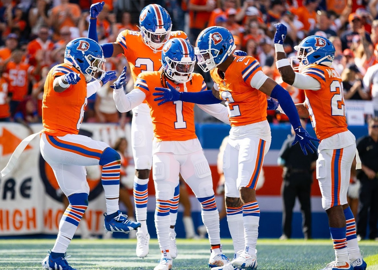
It was obvious from the unveiling in April that the Broncos intended to explore the vast stylistic possibilities their new uniforms afforded them:

And, indeed, through 18 games of regular season and postseason play, Denver wore thirteen (!) different uniform combinations. (They wore two different combinations over three preseason games – each with white jerseys – but those were all worn in the regular season, too.)
The new uniforms have a couple of elements that I’m not sold on yet. For example, I get that they’re trying to evoke a Rocky Mountain theme with the triangles. That angular concept, more abstractly, works well enough on the sleeves. It doesn’t work inside the numbers or on the helmets, however, where it creates unnecessary visual clutter.
Likewise, the asymmetrical and partially truncated pants striping is a minor annoyance. But after decades of putting up with the “parentheses” side panels on the last uniform set, I’m willing to accept the tradeoff.
Probably the most surprising aspect of the new uniforms was how much the socks made a difference in the overall look. As you’ll see below, the choice of socks could significantly affect the uniform grades, even when that was the only difference between certain uniform combinations.
But enough introductory chatter. Let’s dive in so I can show you what I mean!
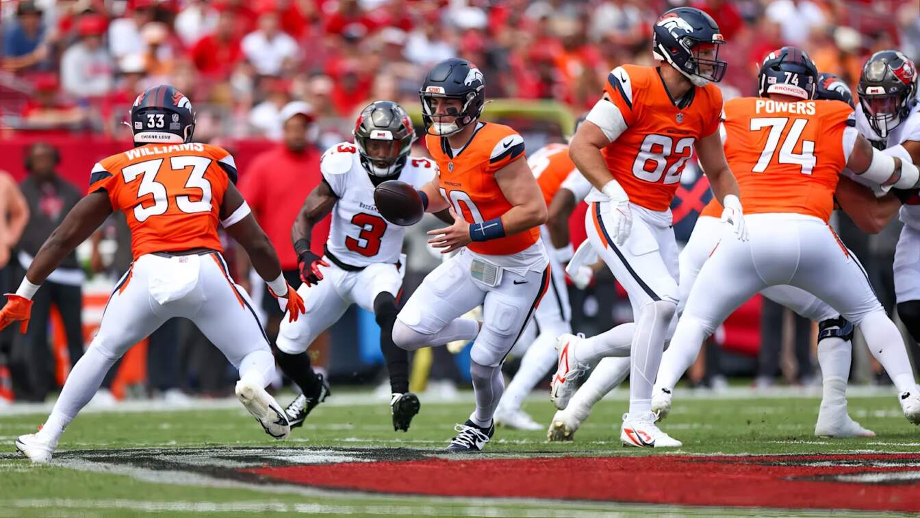
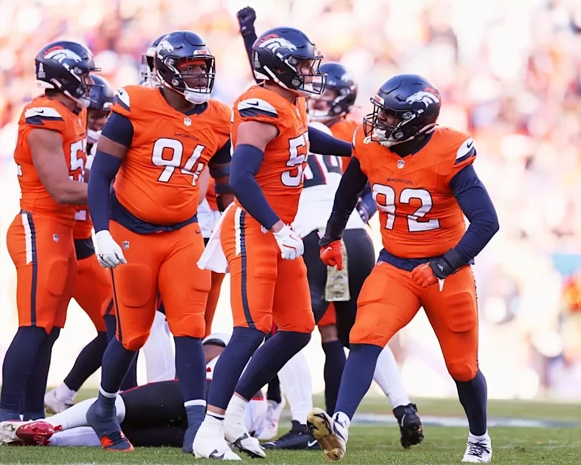
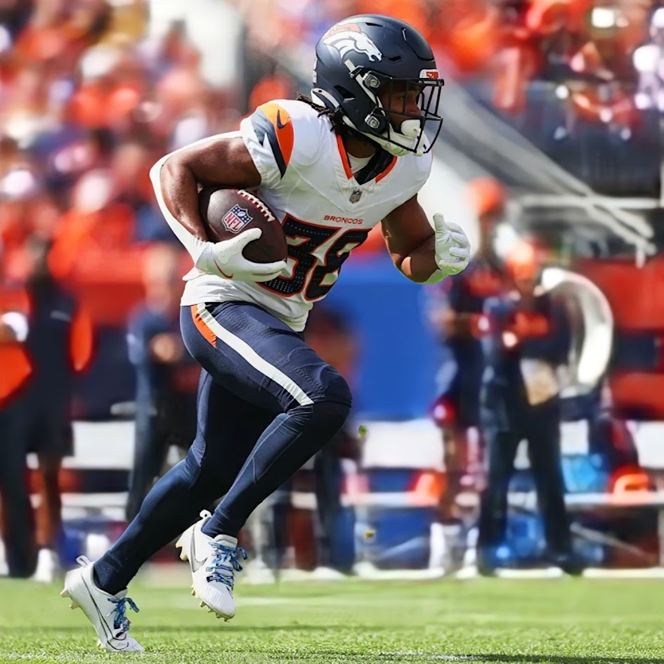
Denver debuted their new orange jerseys in Week 3, after wearing white for the entire preseason and the initial two weeks of the regular season. (Interestingly enough, they wore this fairly conventional “home” look on the road at Tampa Bay.) This combination came so close to getting it right!
The orange jerseys look great beneath the navy blue helmets, with the white pants balancing out the color palette nicely. Just add some contrasting socks to the look instead of the white hose and you’d have quite a solid-looking uniform.
GRADE: B
It’s amazing what a difference a little color below the knees make to the Broncos’ home unis! The orange socks provided some much-needed contrast to the white pants that the white socks worn in Week 3 simply didn’t do.
And, for the record, I’m not rating these highly just because Denver wore them in the one game I got a chance to see in person this past season. But I’m sure glad they wore one of their best combos when I was there!
GRADE: A-
This combination narrowly edges out the one above because, as much as I love the orange socks, the navy blue socks create a nice bookend effect with the helmet and make the orange jerseys stand out that much more. It’s the closest thing the Broncos wore to a replication of their standard home look from 2012 to 2023, but without the navy side panels. I consider that to be addition by subtraction.
GRADE: A
Amazingly, the Broncos didn’t wear their new orange jerseys at home for the first time until Week 6. And when they did, they scrapped tradition by pairing the jerseys with navy pants, not white.
I think the orange jerseys and navy pants have potential to look decent together with some more contrast at the shin level. I’d be curious to see how the rest of this combo would look by swapping out the navy socks for white. Probably not orange, though. My eyes would need a rest from the constant barrage of color.
GRADE: C
You knew the Broncos would give us a mono-orange look at some point in the season. (In this case, I’m applying the “mono” label to the coupling of the jersey and pants, but with socks becoming such an important component of the NFL’s new mix-and-match looks, maybe I shouldn’t use “mono” in this instance anymore.)
I’m never going to prefer this look to white pants. But to this combination’s credit, the dark blue helmets and socks did just enough to separate them from some of their more orange-obsessed superfans (RIP, Kerry!)
GRADE: C+
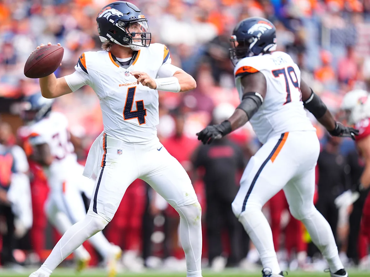
Considering the frequency with which Denver wore this bleached-out combo, you’d think they were trying to add “White Crush” to their nickname repertoire. I’m sure it’s only because of the league’s alternate helmet rules that the Broncos haven’t tried topping this outfit with their white helmets and calling it “Rocky Mountain Ice” or some similar nonsense. Ugh!
GRADE: C+
The Broncos’ Week 17 duds are just one more example of how much difference the socks make to this uniform set.
The blue socks elevate this road combo several notches over the version above. If I squint, I can almost see Rod Smith catching an 80-yard bomb from John Elway for a touchdown in Super Bowl XXXIII and Peyton Manning drilling his last-ever pass for a two-point conversion to cap off the win in Super Bowl 50 (minus the side panels, of course).
GRADE: B+
Other than getting some serious Chicago Bears road uni vibes out of these, this was a pretty decent look for the Broncos. Still, a little more orange (perhaps at the sock level) might reduce the potential for mistaken identity.
GRADE: B
This – THIS! – is how the Broncos chose to debut their new uniform set to the Mile High faithful for the first home game of the regular season?! Seriously? You need a pair of binoculars to spot the orange on these uniforms!
The team said they were trying to beat the early September heat in Denver with the white jerseys. But if that was the case, why wear dark pants and socks that absorb the sun’s rays?
This combination worked slightly better on the road in Week 12. But it was uniform moves like this (and a few others) that had me wondering if the ownership was trying to change the Broncos from a “Predominantly Orange” team to “Predominantly Midnight Navy.”
GRADE: C
These uniforms generated quite a bit of buzz when the Broncos wore them for a home game in the preseason. It was the first time they’d worn orange pants with white jerseys since 1979.
Sadly, this combination made only one appearance in the regular season. That’s a shame, because these really should be the Broncos’ standard road uniforms.
GRADE: A
Maybe I should be careful what I wish for when it comes to the Broncos wearing more orange, because I just might get it! Adding some contrast below the knees can easily be the difference between making a uniform combination pop and looking like you just got back from yoga class. Maybe try again next season with navy socks…
GRADE: C
I’ve long been a skeptic about how the Broncos would look in white helmets. Last season’s faux retro lids basically confirmed those fears. The concept didn’t work last year with mono-orange, and the all-blue look they wore this past season wasn’t any better. (It doesn’t help that the current helmet logo gets lost against all that white.)
Frankly, the mono-navy look might be worse than shoulder-to-ankle orange for a team that’s built its visual identity – and goodwill with the fanbase – on the predominance of orange. I’m willing to entertain the idea that the team can find a combination where the white helmets work, but this isn’t it.
GRADE: D
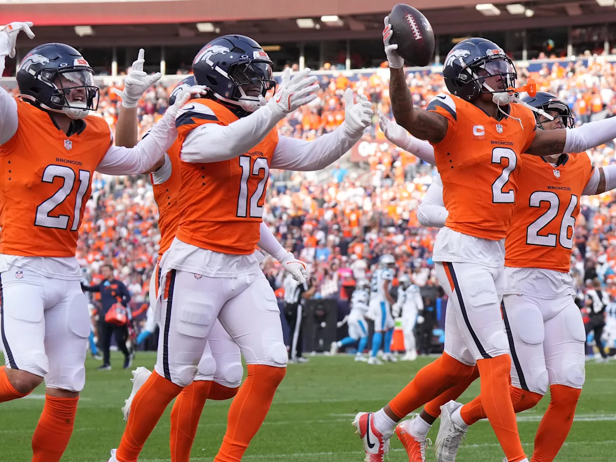
Let’s end this rundown with what I consider to be the best unis the Broncos wore all season (by a wide margin). Put simply, the Broncos haven’t looked this good since the end of their Orange Crush heyday nearly 30 years ago.
I might have had a slight preference for the pant- and sock-striping from the late ’80s and ’90s rather than 1977 versions, but that’s a minor quibble. Worn against two divisional rivals with classic looks, this created two of the best-looking games of the 2024 NFL season.
Everyone, from the fans to the players, loved these uniforms. It’s hard to consider their reintroduction anything less than an unqualified success. You can count my voice among the many calling for the Broncos to bring these uniforms back as their permanent look.
GRADE: A+
Readers? What say you?
link


