Ranking Every Current NFL Alternate Uniform
Highlights
- The Vikings top the list with new White-Out Winter Warrior uniforms & Purple Eaters throwback combo.
- The Patriots’ Pat the Patriot throwback jerseys are a break from monochromatic current attire.
- The Buccaneers moved up with the return of orange creamsicle jerseys.
As the NFL draws closer to the start of the 2024 season, there are new jerseys popping up left and right as teams get set to prepare their wardrobe kits for the new league year.
Recently, the New York Giants and Minnesota Vikings each announced the drop of a brand-new uniform. Some other teams gained new jerseys through a re-brand. But how will those new fits affect their squad’s standings in the final list?
Some influence on this list will be from YardBarker.
Let’s take a look at where the 32 NFL teams rank based on their alternate uniforms heading into the 2024 season…
Related
Vikings Become Latest Team To Unveil New Uniforms
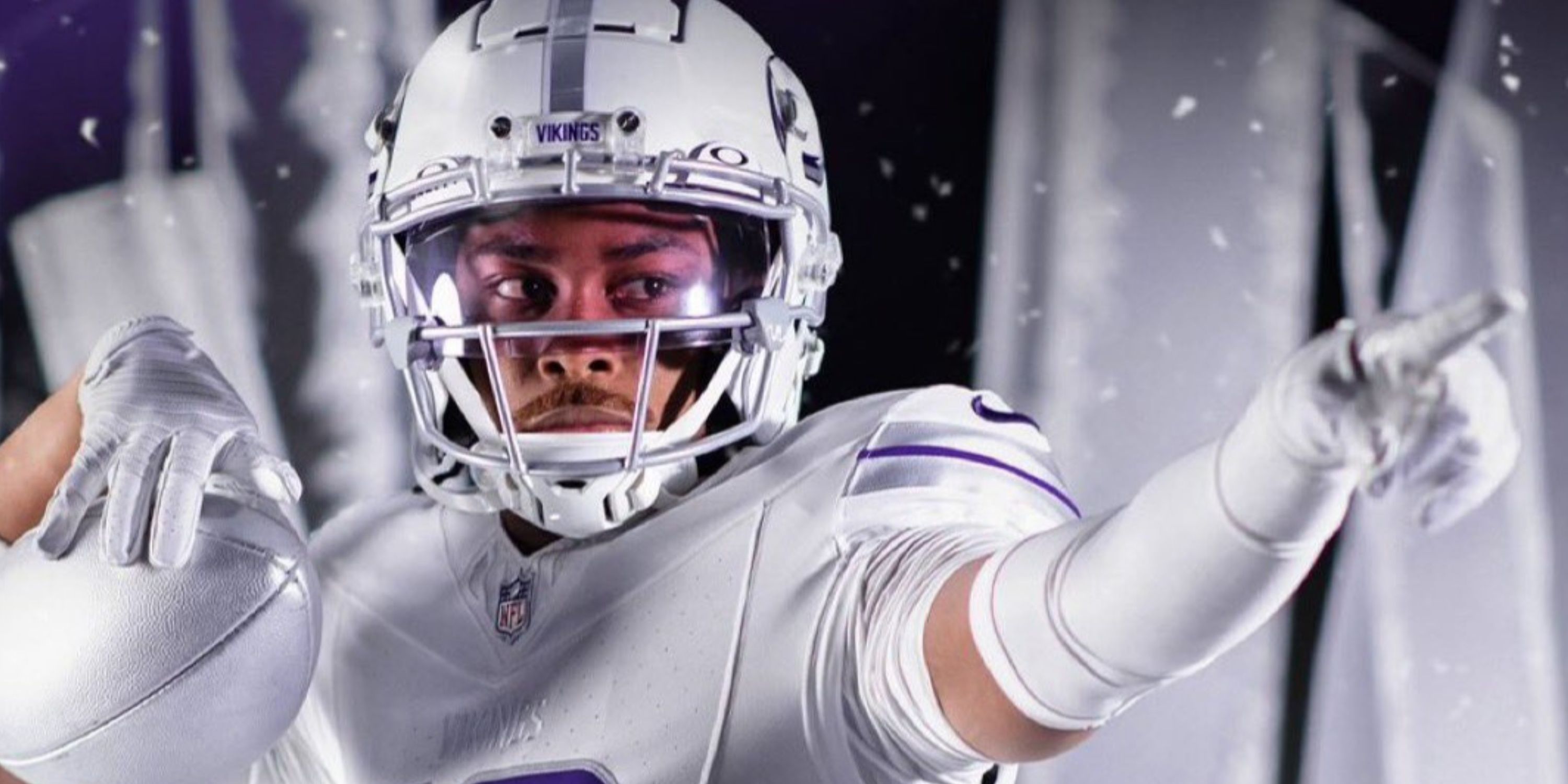
The Vikings will be charging into battle with their new “Winter Warrior” concept.
1 Minnesota Vikings – White-Out Winter
A White-Out Winter Warrior Joins an Elite Purple People Eater Kit.
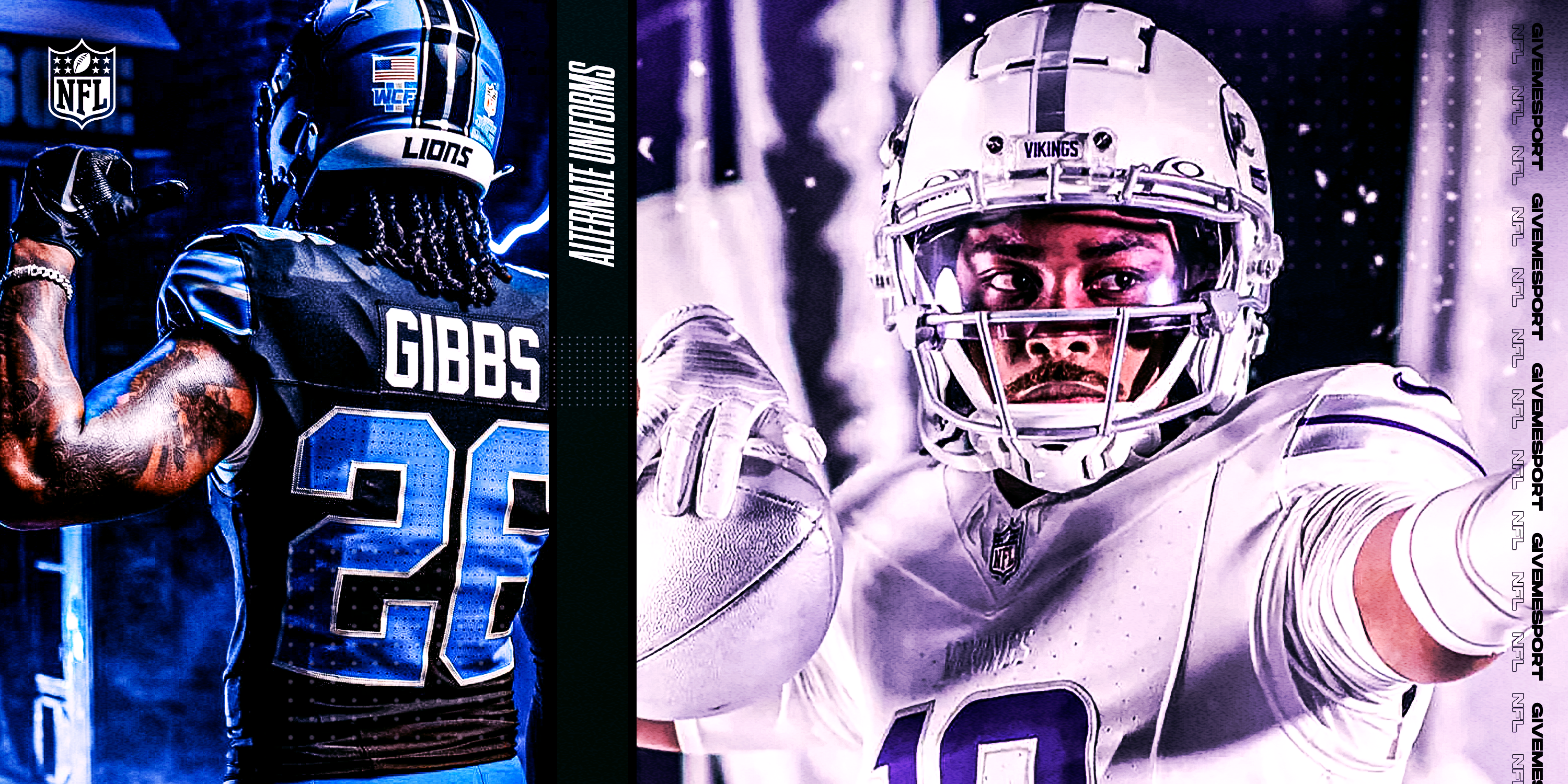
Starting off at the top of the list are the aforementioned Vikings. Their brand-new white-out winter warrior uniforms, which debuted on June 6, are the perfect tie in to the Nordic community. And partnering this with their Purple People Eaters throwback jersey re-released last year, gives Minnesota an elite uniform combination for home and road games.
As Yardbarker describes the latter,
“The Vikings’ homage to the Purple People Eaters years went off without a hitch in Week 1, the narrow loss notwithstanding. The NFL’s purple champion did look better in its road attire of the era, but these — with the sleeve stripe tying the look together — bring an improvement on Minnesota’s present home appearance.”
With this uniform joining the rotation, it was a relatively easy decision to put Minnesota at the top.
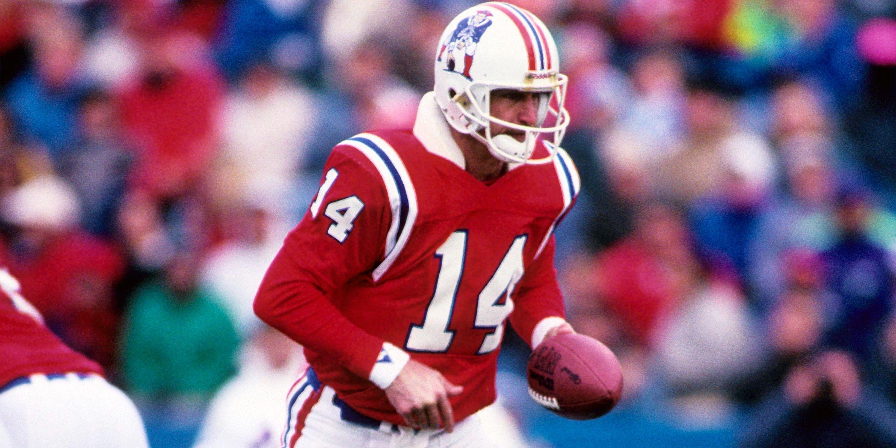
2 New England Patriots – Pat the Patriot
Despite a lack of statistical success, Pat the Patriot looked sharp on the field.
When discussing throwback logos and jerseys, one of the first that should come to mind is Pat the Patriot of the New England Patriots. Now sure, having only six winning seasons with the logo and the red primary jerseys for the home games is not exactly something that a big media market like Boston will enjoy.
Considering how dull and monochromatic the current attire is these days for the Pats, the throwback alternates are a very nice break from the ordinary.
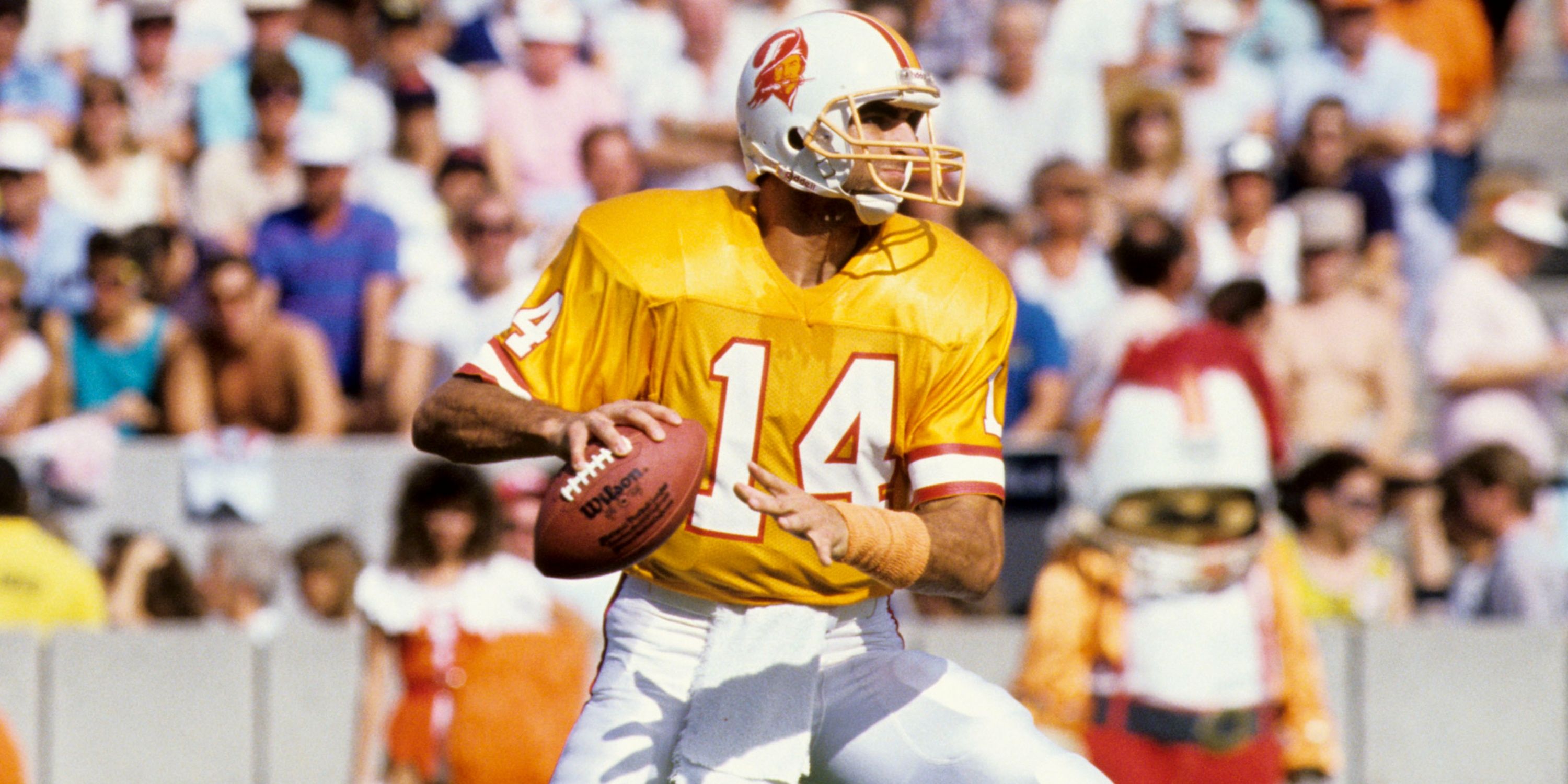
3 Tampa Bay Buccaneers – Orange Creamsicles
Bucco Bruce and the Orange Creamsicles are a major contrast from the past styles of Tampa.
When people think of the Tampa Bay Buccaneers, some minds immediately jump to the ugly 0-26 start to the franchise’s history. But the thing that seems to be most pleasing to the eye is the Bucco Bruce logo and the orange creamsicle jerseys, as they are affectionately known.
The Bucs brought back the orange jerseys last year, which, along with their current wardrobe, is a major step up from the Jameis Winston-era jerseys with the digital alarm clock-esque numbers. Thus, Tampa claims the number 3 spot on this list.
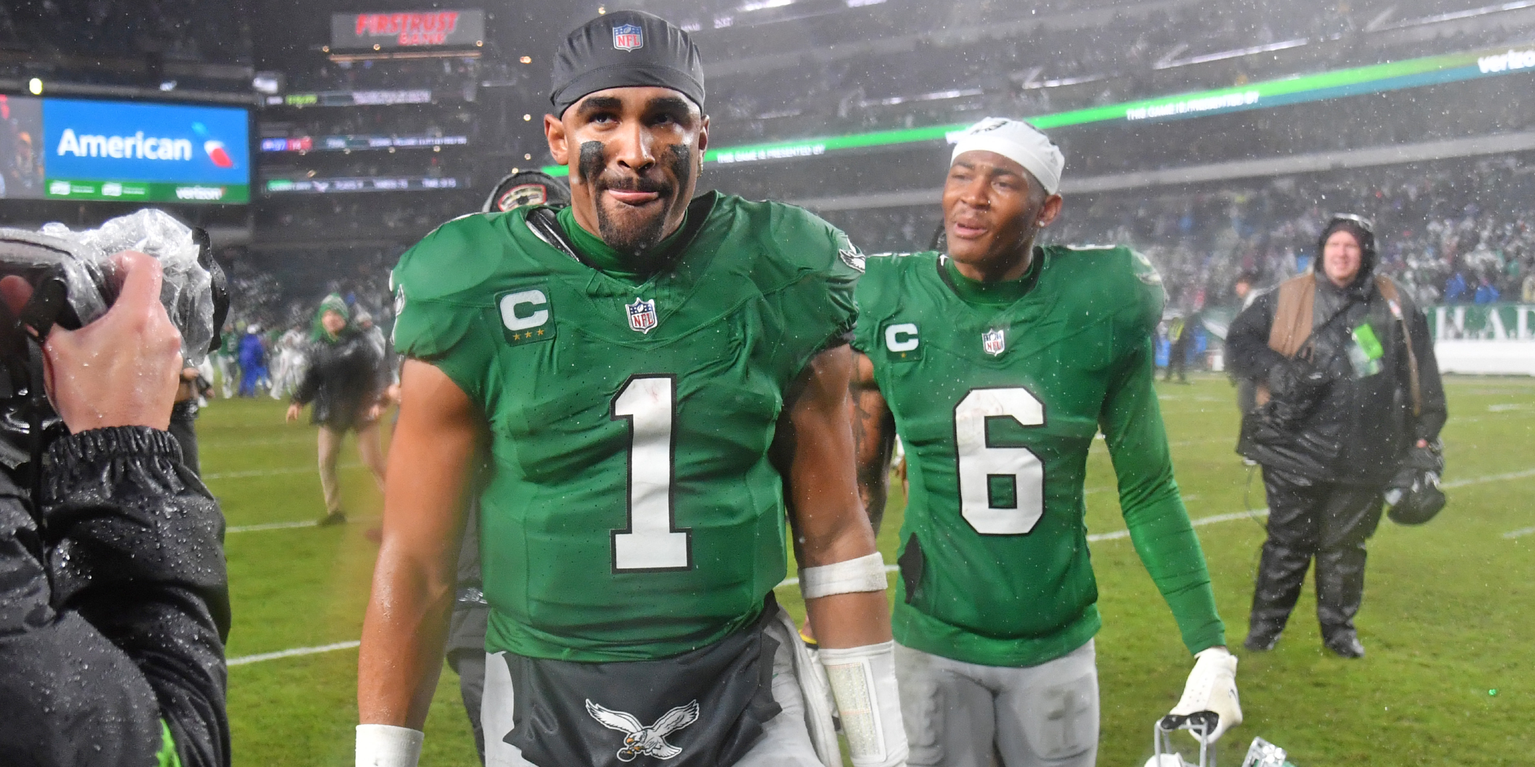
4 Philadelphia Eagles – Kelly Green
The Eagles are considering bringing the Kelly Green back permanently.
Coming in at No. 4 on this list are the Philadelphia Eagles. While their current midnight green tops and black alternates are worthy of some healthy discussion, these birds brought back their Kelly Green jerseys from the 1980s last season. And it immediately paid off to the tune of a couple of nice wins. Plus, the old logo is a great fit for any NFL broadcast score bug.
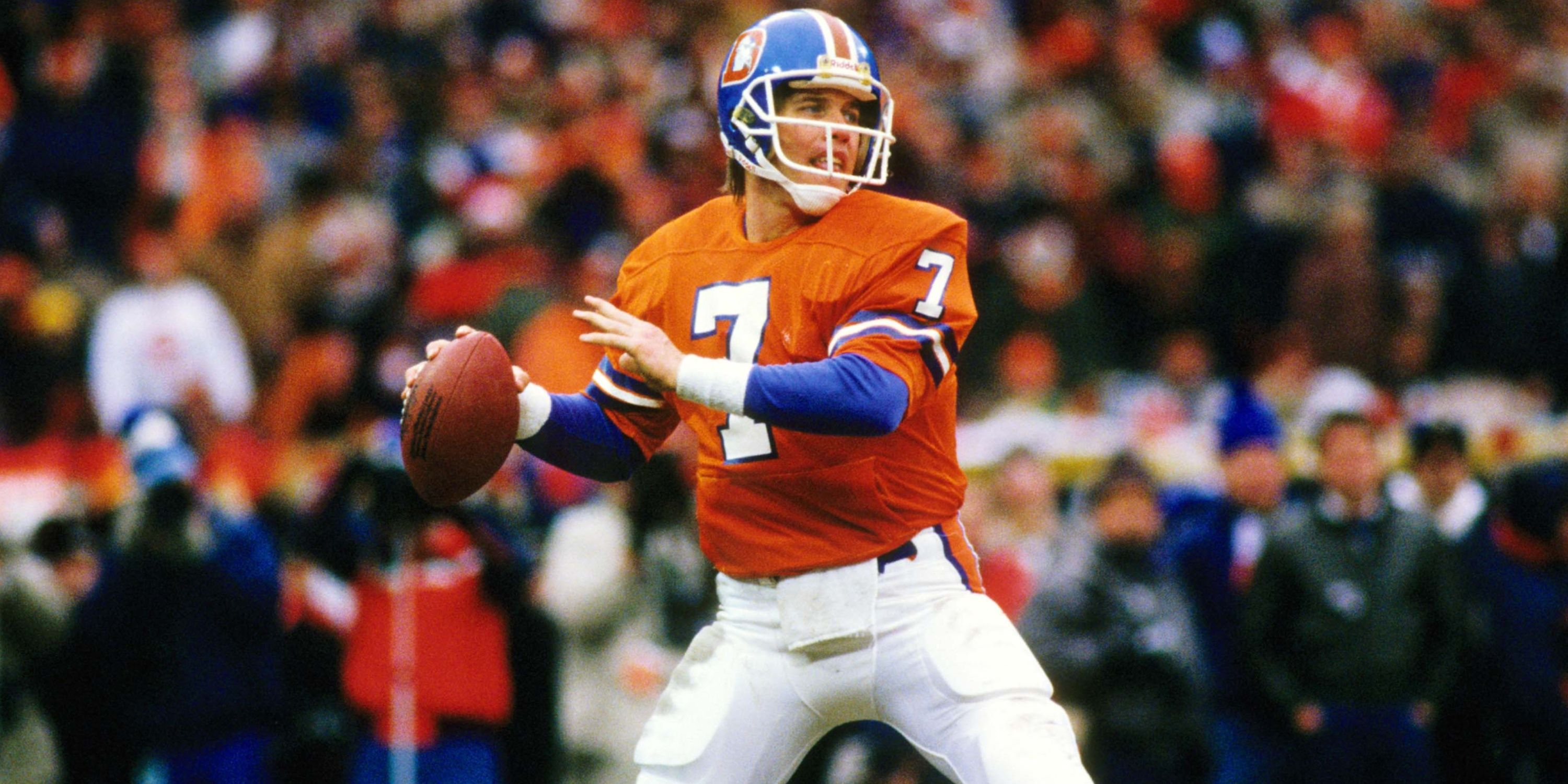
5 Denver Broncos – Mile High Collection
Re-brand rewards fans with Orange Crush-esque revival.
Okay, here’s where the list starts to divert into some debate. At no. 5 is the Denver Broncos. Sure, they may have potentially botched their re-design when they released their new “Mile High Collection” uniforms.
However, one particular jersey stands out as a major saving grace. Their “Orange Crush” uniforms during the John Elway days. That throwback alone is a major plus to that wardrobe, thus earning Denver a top 5 ranking.
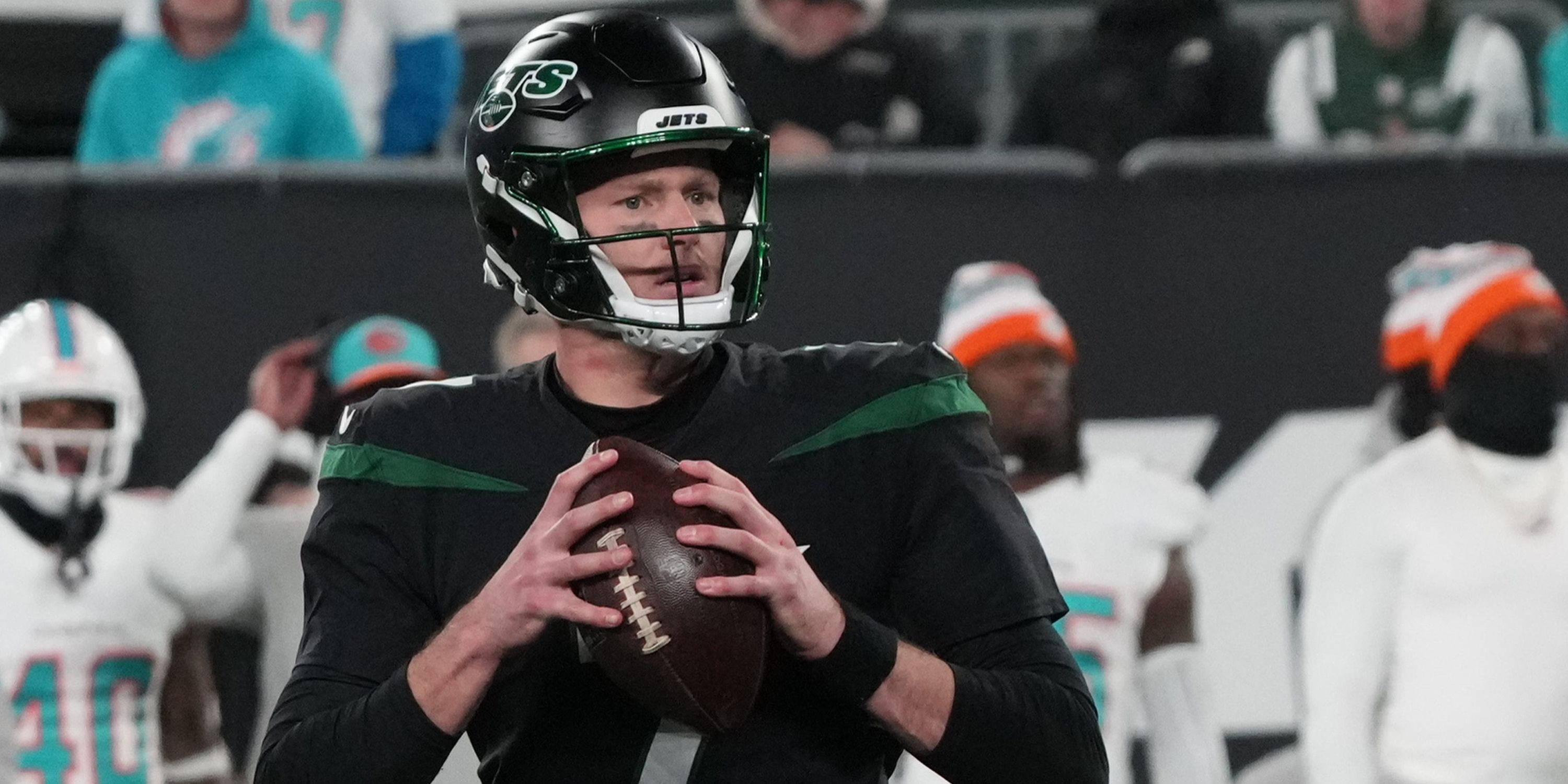
6 New York Jets – 80s Inspired Re-design
New York Sack Exchange of the 1980s inspired in re-design.
At no. 6 on this list are the New York Jets.
Like the Broncos, the Jets went in with the old is new trend, bringing the 1980s jerseys last season, triggering defensive memories of the “New York Sack Exchange.”
Now, the Jets appear to be making this their permanent look. The white and green uniforms are nice, plus an updated black jersey to fit the logo finds the Gang Green in the top 10.
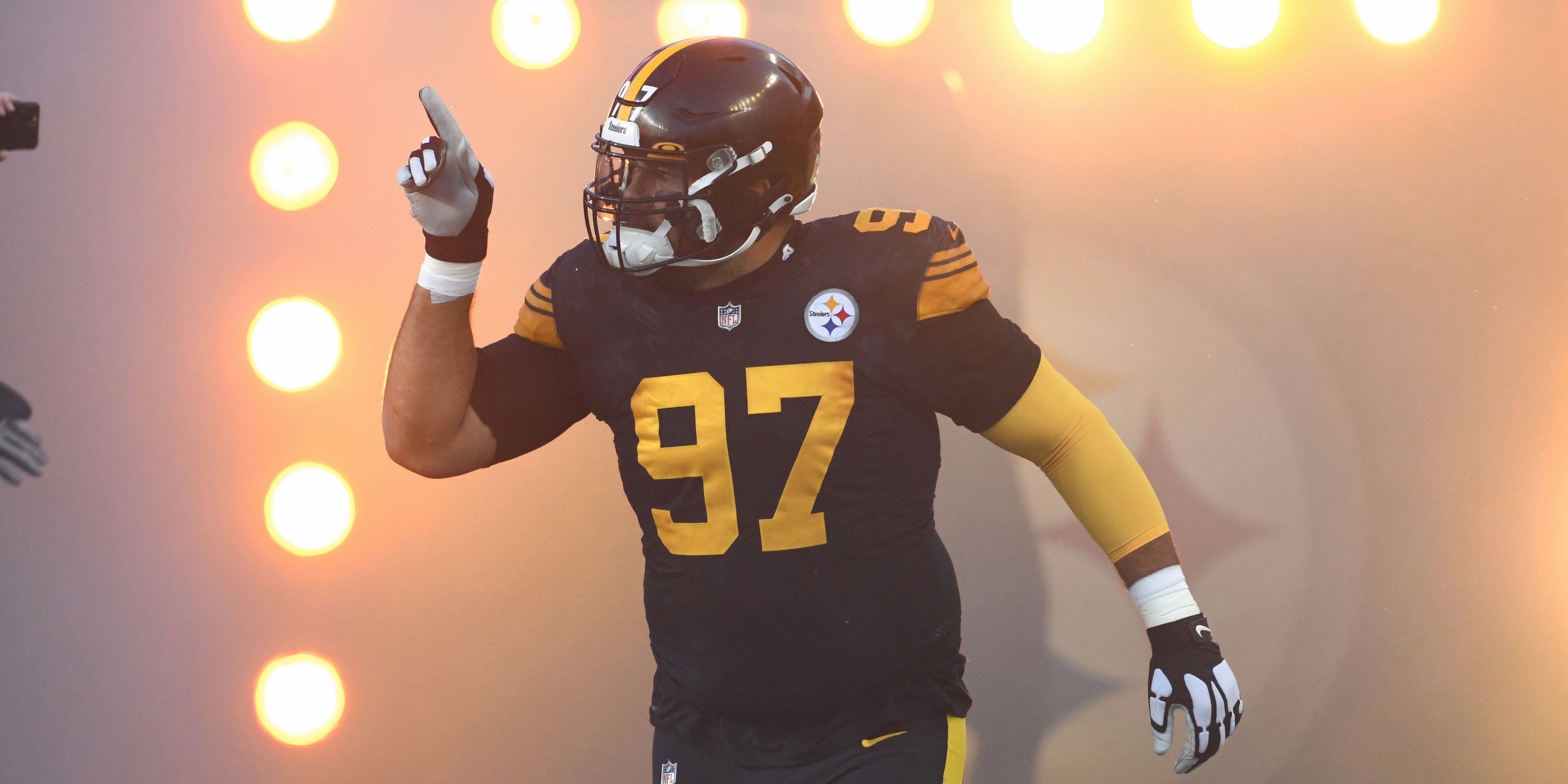
7 Pittsburgh Steelers – Color Rush
The days of Franco Harris and Terry Bradshaw are encapsulated perfectly.
Our first AFC North joins the list as the Pittsburgh Steelers pop up at No. 7. It’s very difficult not to make black and gold look good on a jersey, and the Steelers score some major props with their combination.
Bringing back the early ’70s dominance with Franco Harris, Terry Bradshaw, and the block number, it’s the perfect jersey to fit the Steel City culture. Their current black Color Rush jersey with gold numbers is also a nice touch.
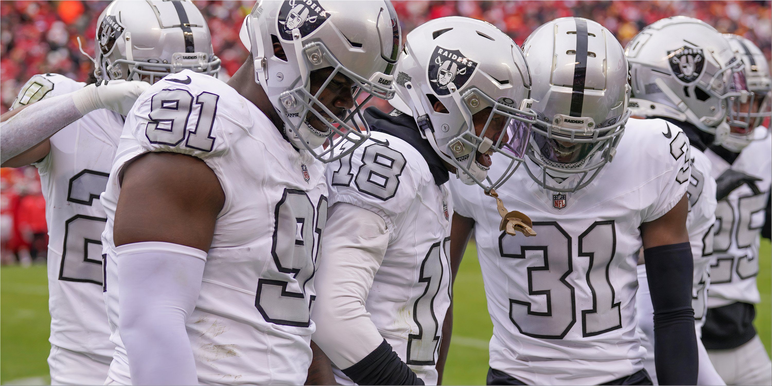
8 Las Vegas Raiders – Silver Numbers
The silver numbers pop on is a very basic color scheme.
At No. 8 on the list is a stop in Sin City.
While the Las Vegas Raiders may have a very simple black and silver color scheme, it’s iconic. When you throw on the silver numbers on their white jerseys, which could be dubbed as either a throwback or a Color Rush, make it a very nice pop and stand out among the basic tastes.
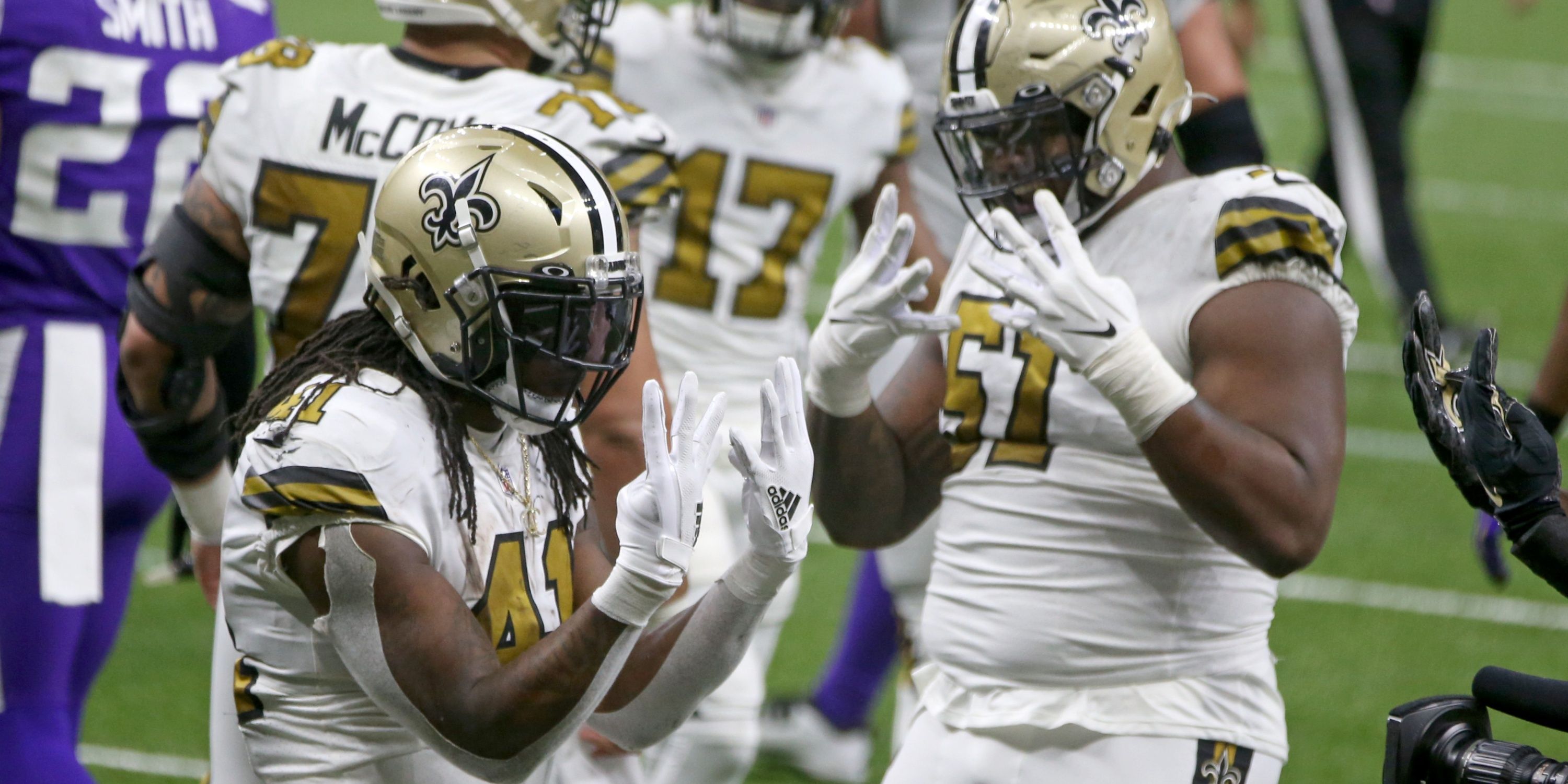
9 New Orleans Saints – Gold Numbers
Whether it’s black or gold, the Saints can’t go wrong with their Color Rush get-up.
At no. 9, the first NFC South representative on the list, the New Orleans Saints. The gold pants to go with either the home black or the road white jerseys are always a fun combination. However, the Color Rush is what sticks out to me the most.
The gold numbers are beautiful, and the black alternate helmet they debuted to go with the Color Rush adds a nice element to it as well.
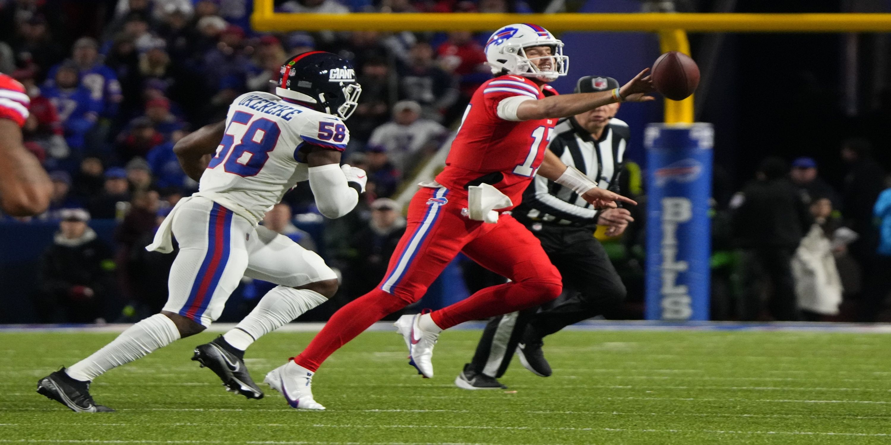
10 Buffalo Bills – Red Color Rush
The Red Color Rush still looks solid on the field.
Ten spots in, and we already have our third AFC East representative. This time, it’s the Buffalo Bills. The white throwbacks to their days in the American Football Conference before the merger were very nice.
The Red Color Rush that’s still in use today is also very aesthetically pleasing. It might not be top 5 worthy, but the Bills could be a sleeper team in some minds for best uniform.
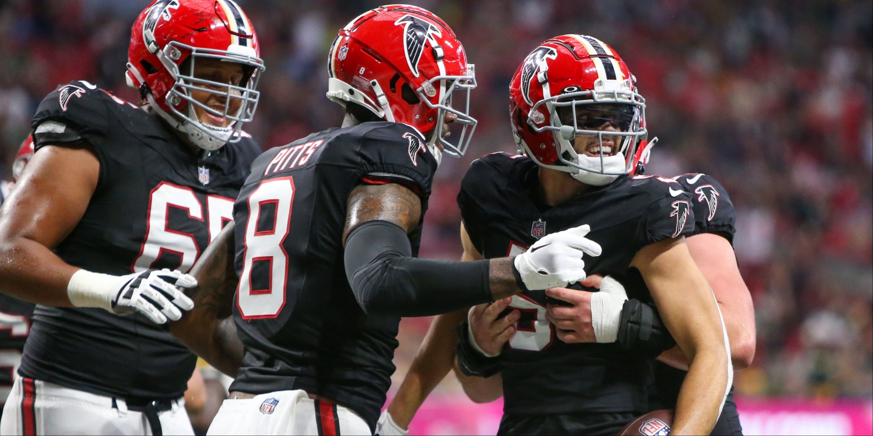
11 Atlanta Falcons – Red Helmets
The Dirty Birds crack the top 15 with the return of their red helmets.
Think back to the days of Deion Sanders. The Atlanta Falcons are at No. 11 on the list.
Their bold 90s black jerseys mesh really well with the old-school red helmets. The black helmets also work well here too. Their red-to-black gradients, on the other hand, ding them a few spots down the list.
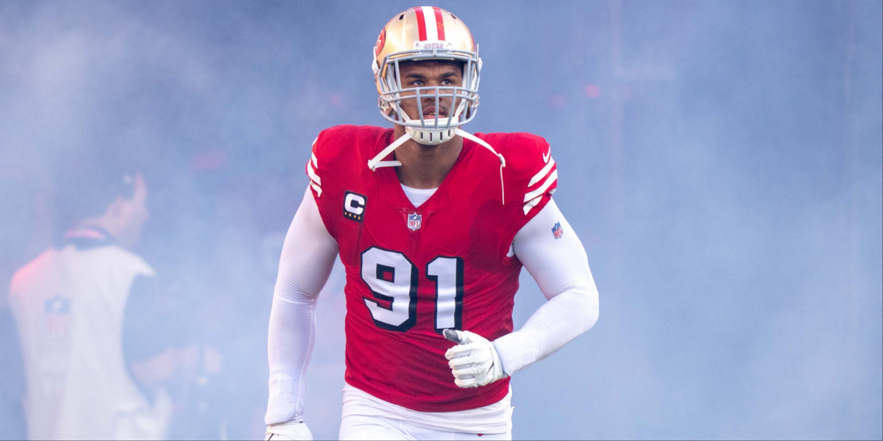
12 San Francisco 49ers – 75th Anniversary
The throwbacks to the 75th anniversary should arguably be their permanent look.
The NFC West gets its first entrant on the list at No. 12, as the San Francisco 49ers with their 90s uniforms make an appearance.
The white 90s uniform is designated as their current Color Rush, while the red, pictured here, gets the nod as the throwback. This worked before as a primary set. Why can’t it work again? Maybe the current default look is just too consistent with success.
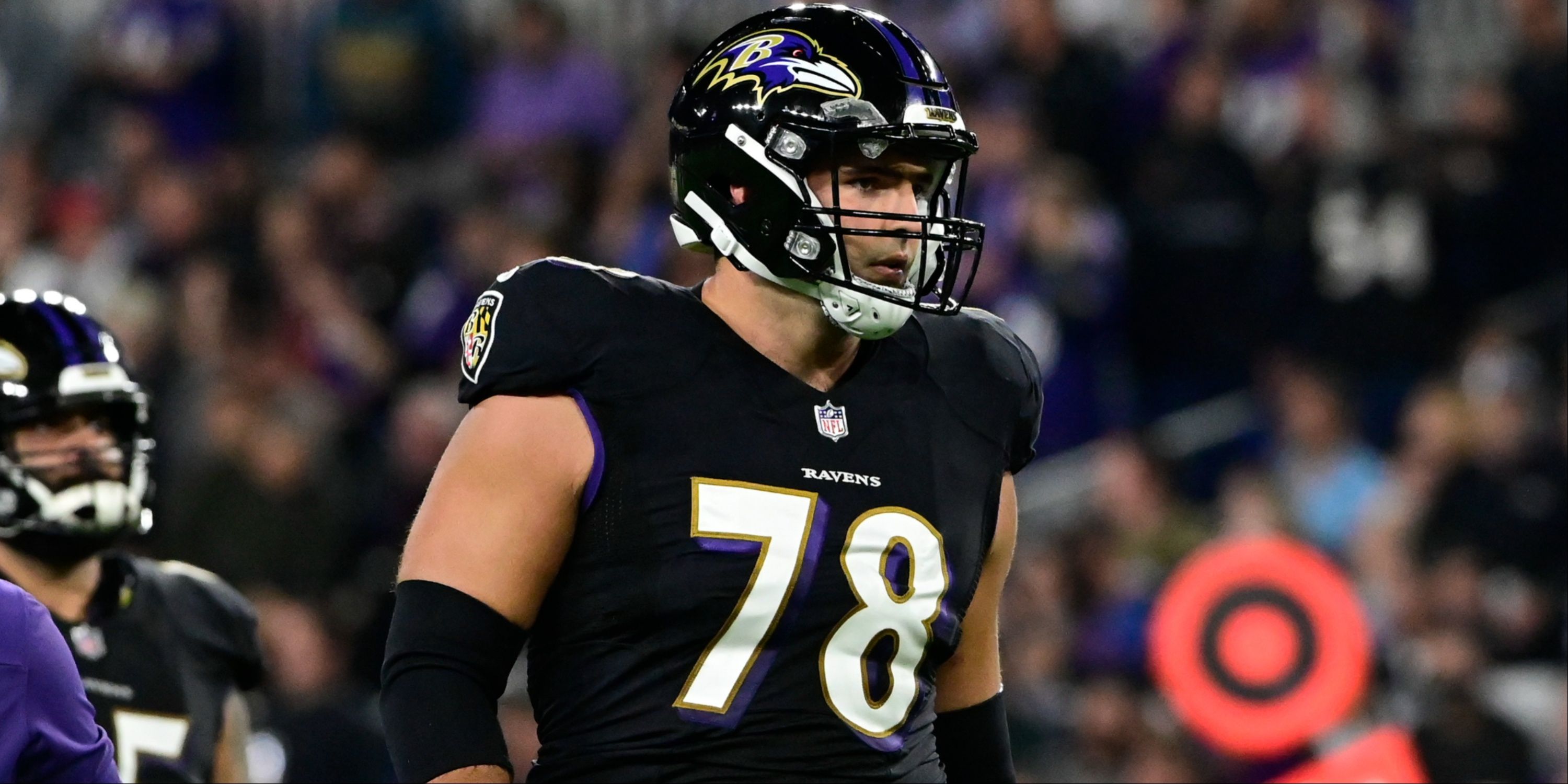
13 Baltimore Ravens – All-Black Uniform
The colors fit well with the city of Baltimore. Maybe a bit too much monochrome?
The Baltimore Ravens land in the no.13 spot here. The black and purple perfectly match with the title bird of Edgar Allan Poe’s famous poem. The purple and gold work well with the Color Rush program.
Perhaps the all-black makes it look a little too… dark and dreary. That being said, with purple and black in the color scheme, it’s hard to mess up any combination.
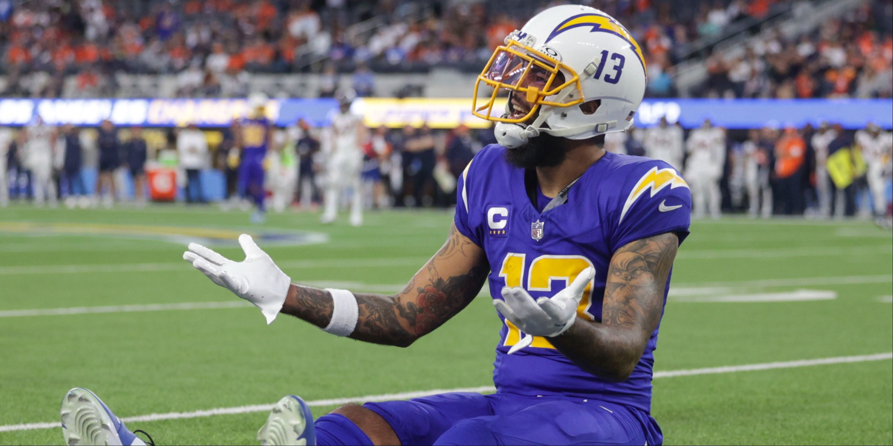
14 Los Angeles Chargers – Royal Blue Pops
Their 2020 re-brand didn’t miss. It wasn’t exactly a big hit, either.
Coming in at No. 14 is the Los Angeles Chargers. While their primary uniforms with the powder blue tops and the gold pants are very nice, their alternates could use some tweaking.
Their navy blue color rush alternates leave fans a little confused. The royal blues do atone for that, though. It’s a nice little quasi-throwback. A fauxback, if you will.
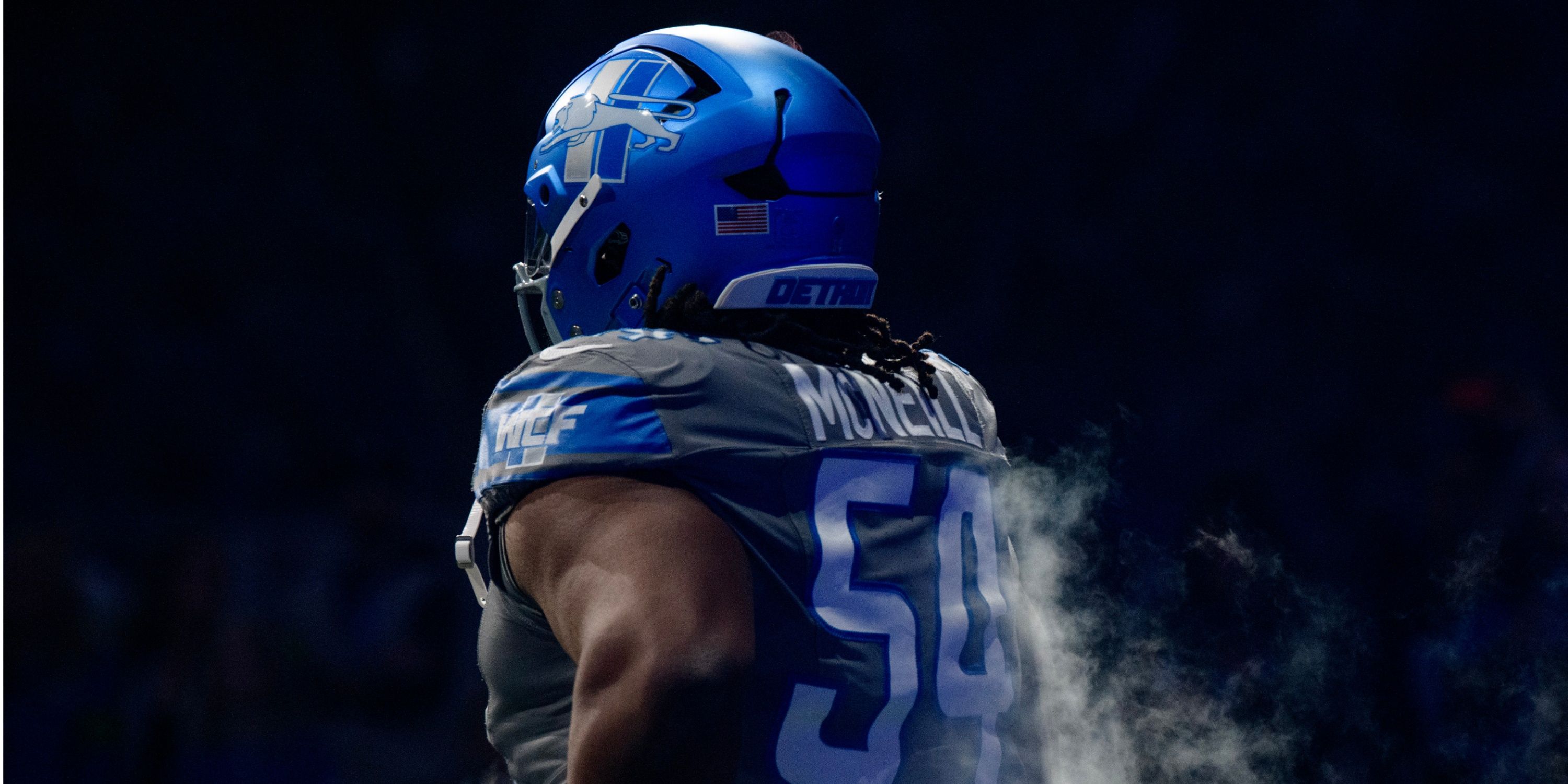
15 Detroit Lions
The new uniforms are a nice tribute to Barry Sanders, but the all-gray fits from last year are a negative.
This is probably pretty low, but the Detroit Lions check in at no. 15 on the list. Their new uniforms, which go back to the 90s, salute one of their all-time greats in Barry Sanders. But their all-gray jerseys from last year just look too much like another jersey from a certain different sports league.
The black jersey and blue helmet combination has not been seen in action yet, so there are no opinions to be given on it for now. However, this ranking can be very different once we see them on the field.
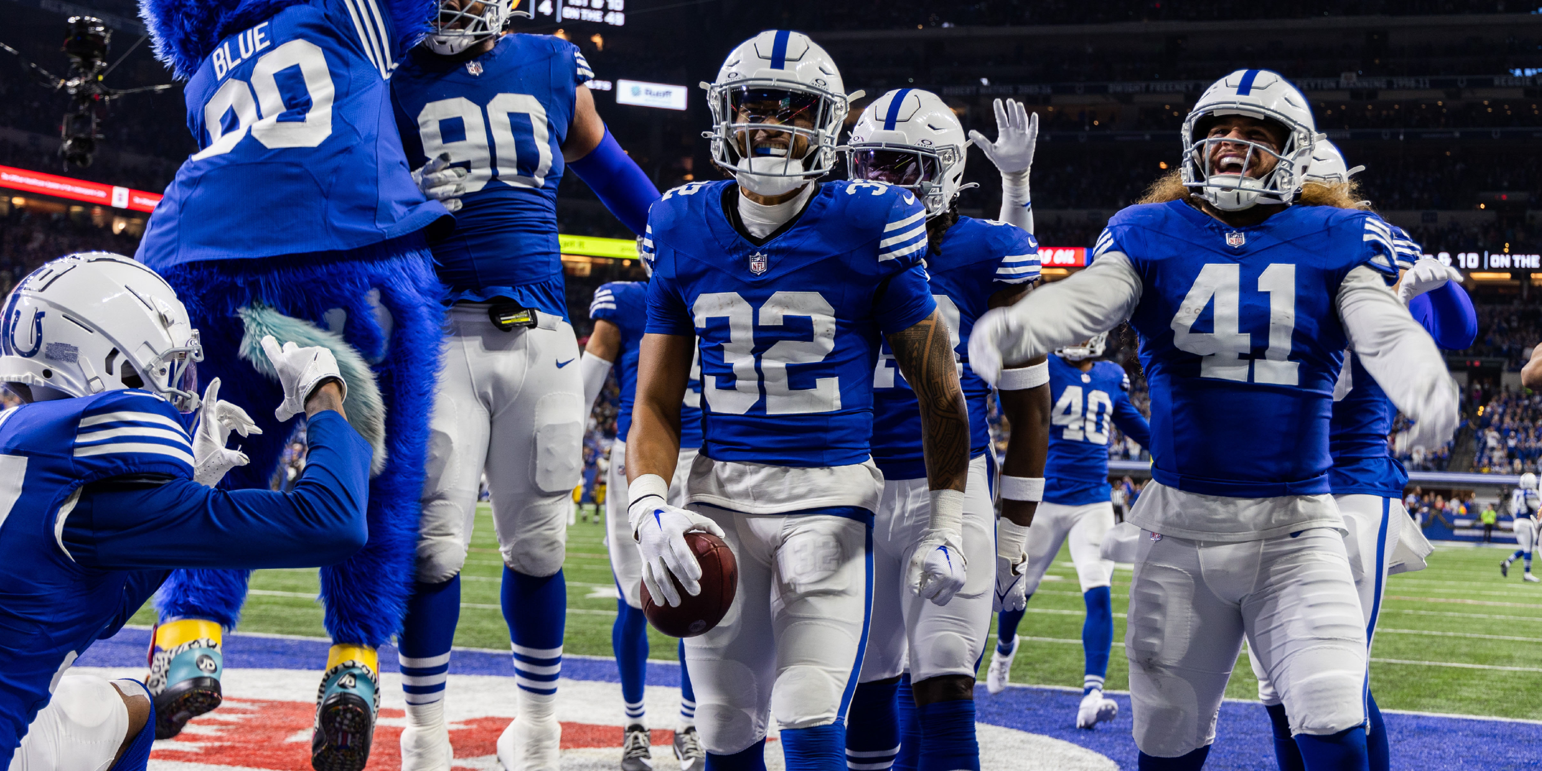
16 Indianapolis Colts – Contrast of Styles
The throwbacks and the Indiana Nights with the Black Helmet are polar opposites.
What is there to say about the alternates for the Indianapolis Colts? The throwback matches the blue and white ideas, plus it brings back memories of the late, great Johnny Unitas at quarterback. It’s a nice retro jersey.
Related
5 NFL Teams That Need New Uniforms
These teams should seriously consider going back to the drawing board when it comes to their threads.
Their “Indiana Nights” jersey with a black helmet, on the other hand… eesh.
Polar opposites that perfectly place Indy in the middle ground.
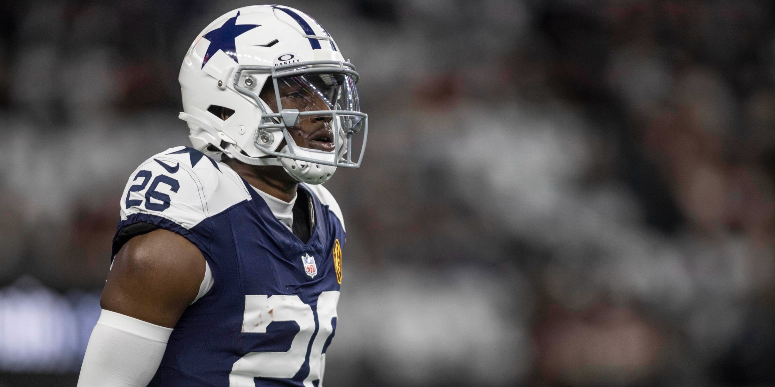
17 Dallas Cowboys – White Helmet and Shoulder Trim
Throwbacks net more negatives than Arctic White Color Rush net positives.
At number 17 on the list, the second NFC East squad, the Dallas Cowboys. The Cowboys have a nice white Color Rush jersey that they call the “Arctic Cowboy”.
But the 1960s throwback just doesn’t sit well. It seems… a little too out of place. The Cowboys typically roll these out on Thanksgiving Day, but they have several options in their history that they should consider over their 60s look.
18 Tennessee Titans – Oilers Throwbacks Should Be The Norm
The all Columbia Blue jerseys don’t look as sharp.
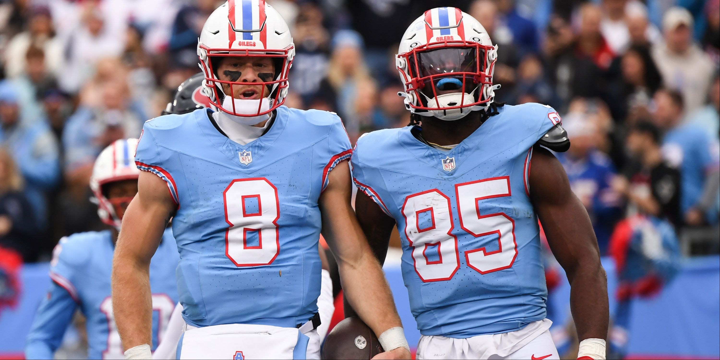
The Tennessee Titans were one of the more recent teams to take advantage of the NFL dropping their long-standing one-helmet rule in 2022. And they did so quite nicely, bringing back the old Houston Oilers throwbacks out of the closet. If we were strictly factoring in the Oilers look, the Titans would probably top the list.
However, what gets them to fall all the way down to 18 is their all “Columbia Blue” jerseys. The baby blue just does not seem to work well with the Titans’ logo.
19 Chicago Bears – Too Much Orange
The orange helmet is an odd choice for their alternate jerseys
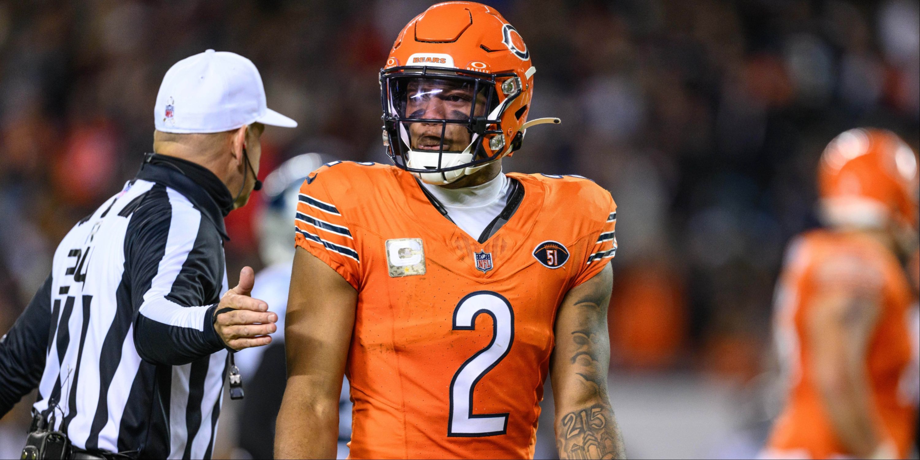
Okay, the Chicago Bears go at 19. Why? Their orange helmets.It just seems a little too bright for what the Bears typically personify as a franchise.
It makes them look like a couple of Ohio teams who will be mentioned later in this list. Their throwback jerseys with University of Michigan inspired helmets are nice. But orange-on-orange-on-white just doesn’t make sense in Chitown.
20 New York Giants – ‘Giants’ Helmet Should Be Permanent
Century Red jerseys bump the G-Men way down the list.
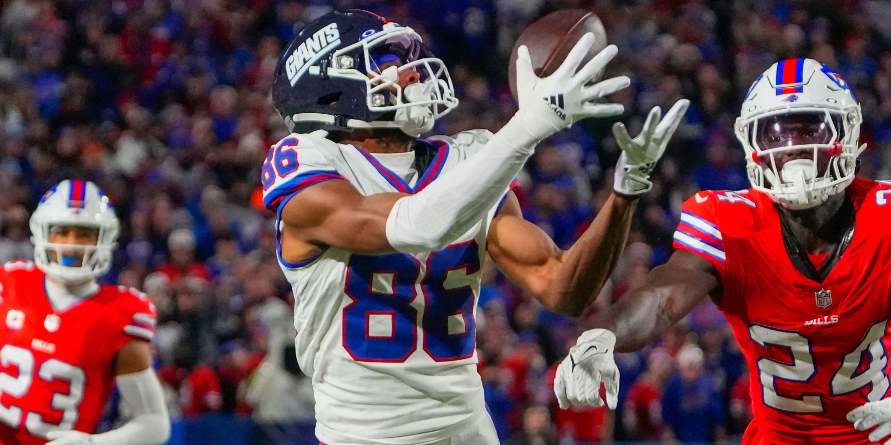
The 20th spot on the list belongs to the New York Giants. The “Legacy Collection” uniforms during the Lawrence Taylor era were recently, as the white being the color rush and the blue being the throwback. If that was the extent of their alternates, the Giants would be way higher on this list.
However, they recently released a new “Century Red” jersey, which looks very much like the Bears throwbacks. If you copy off a team, that’s going to ding your ranking quite a bit.
link

