Greg Seher’s NFL Uniform Concepts and Tweaks (NFC East Edition)


Long-time reader and submitter Greg Seher (who recently had submitted concepts for the NHL and NCAA) has returned, this time with some concepts and tweaks for the NFL. Similar to other concepters who have redesigned entire leagues, I will feature these over the next two weeks or so, featuring one division per day. Here are the concepts previously posted:
AFC East
Today we’ll look at Greg’s concepts for the NFC East. Enjoy!
by Greg Seher
Some uniform basics that are league wide:
1. I’d get rid of the free for all of alternate uniforms. Go with standard dark home and white away uniforms (aside from hot weather white at home exceptions). I’d give each team a dark and white throwback option, and all teams wear throwbacks once a year on Thanksgiving. For a few teams I’d give them fauxback exceptions instead of true throwbacks when needed.
2. The large college style chest wordmarks don’t look right, but I do like the small wordmarks below the collar, these are being added to all the teams.
3. No logos on the back collar of jerseys, that’s a bad trend, if you want to put a maker’s mark somewhere maybe put it there.
NFC East
DALLAS COWBOYS


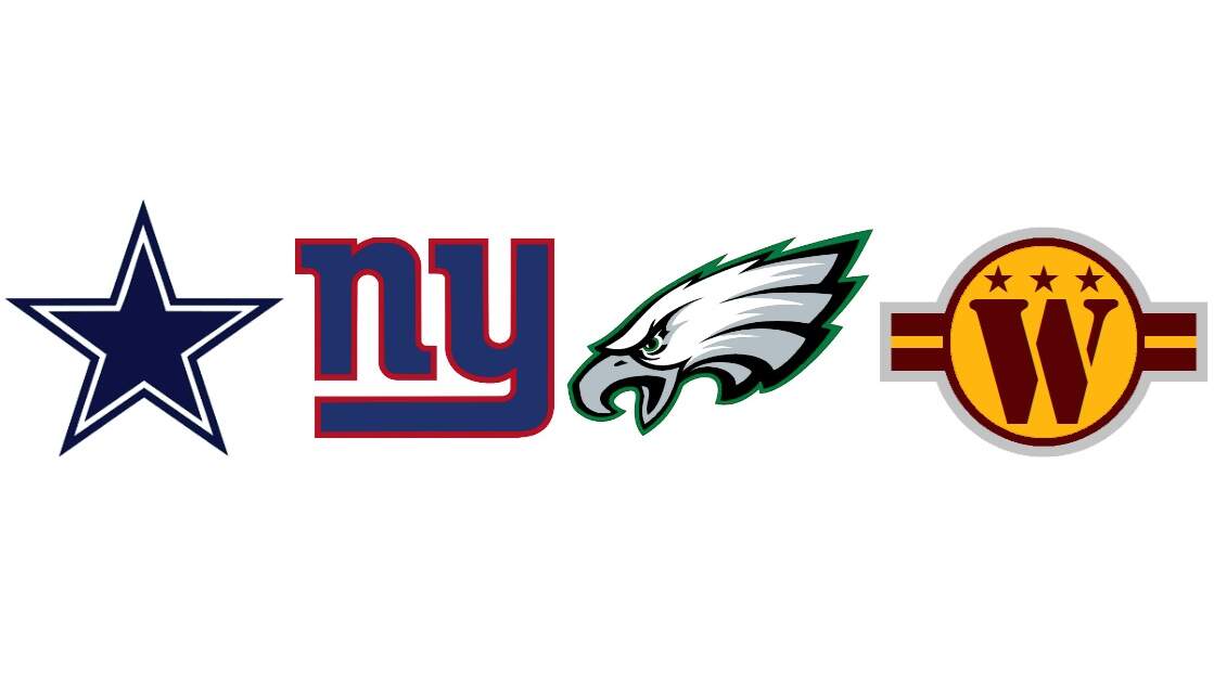
They should start wearing their navy jerseys at home. Dropped the stars on the sleeves so their navy jersey matches the white, only difference being a small silver outline on the stripes. As far the their mismatched colors, dropping royal blue and standard silver, and instead using navy and the bluish silver throughout, including the helmets. The white helmet designs from their first season are great for the throwback uniforms.


Pretty good look, but a few changes. For a team who is called big blue, and clearly has blue as their primary color, why is their white/road jersey using solid red numbers and stripes? Switch that to blue and it looks much better. For their alternates I went with their red 1938 and white 1990 championship season looks.


Always preferred the old kelly green, so going back to that but keeping a lot of the design elements of the modern look. Making silver much more prominent, also simplifying the numbers to old block style and updating the font. Alternates throw back to their 2017 midnight green championship season as well as the all white design from the early 1970s.


The uniforms and logo since they switched to the Commies are awful. I do like their idea of incorporating the Washington city flag into the design, so I worked the stripe pattern and three stars into their logo and uniform. The W, stars, and stripes into a military like roundel. Going with the yellow pants full time. For the alternates I used spearhead design from 1960’s. The uniform they wore for all 3 of their Superbowls in the 1980’s and 90’s with the burgundy pants works here, only difference is it has a Commanders W logo in the style of the helmet logo from that era.
Thanks, Greg.
Readers? What say you?
link


