
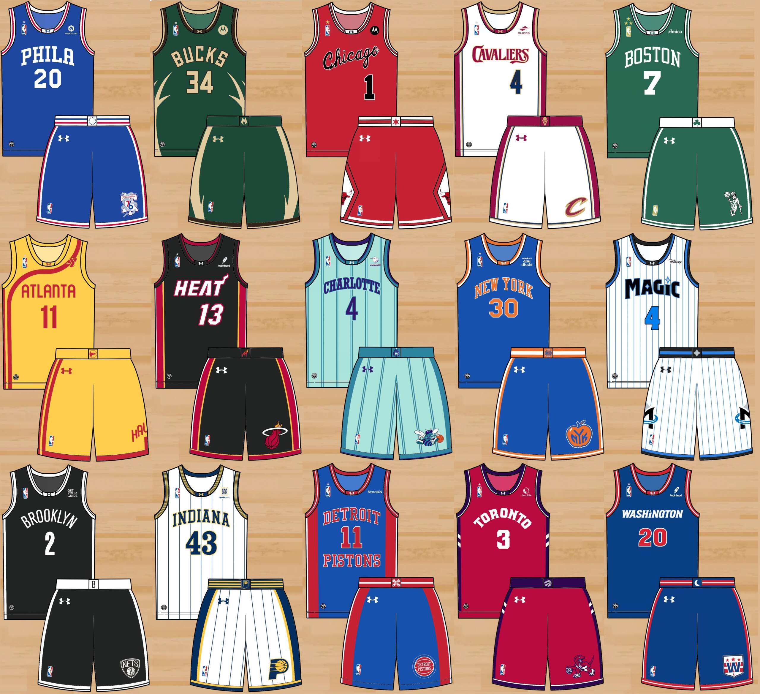
NBA Uniform Refresh: Eastern Conference

Good morning, Uni Watchers. It’s Friday — we made it.
I was recently contacted by long-time reader Alonso Perez, who pitched the following to me:
Hey!
Long time reader of the blog, and love what y’all have done with it over the last year. With the NBA playoffs in full swing I would love to submit a full-league set of concepts I’ve been working on. Like many people I love watching basketball, but feel like a lot of identity has been lost in the past few years of city connects, throwbacks, and tinkering. I’ve made 4 jerseys for every team, trying to capture their “core identity” through home, an away, an alt, and an updated retro in their new, unified colors. While the designs lean traditional, and are inspired by college basketball, I tried to be original and take some risks as well.
It would be an honor to share the series in a post or series on the blog. I would love to share some quick explanation on my process and the designs as well.
Thank you!
Alonso Perez
And with that, I of course told Alonso to shoot me his concepts and descriptions — which are below. Alonso is taking on the Eastern Conference today, and next week, we’ll have his concepts for the West.
Enjoy!
By Alonso Perez
In the end, it’s all about the colors. Ask your friends, the normal ones, what the Lakers’ striping pattern is, and they’ll draw a blank. Ask them what the Lakers colors are, and they’ll say ‘Purple and Gold’ before you’re done asking the question. That’s the biggest issue with the past few years of NBA jersey designs; even ‘traditional’ teams now appear weekly in 3 or 4 distinct color schemes, reducing the instant recognition and nostalgia that comes from watching them play. Even the good alts, like the Heat’s Miami Vice set or the purple Raptors throwbacks, muddy the water of what their team’s colors actually are.
What the NBA needs is a jersey refresh. I implemented a fairly strict team colorway across the jerseys of every team. I went with a new manufacturer, Under Armour, to move on from the excesses of late Nike and Adidas. Drawing from Under Armour’s excellent work in the college game, I went for clean, straight lines and bold color, rather than the intricate detailing and swooping lines increasingly seen on NBA jerseys.
I want these jerseys to feel new but nostalgic. I tried to make each jersey in each set something I can imagine a fan being excited to buy. Not all the sets are fully uniform, but they are unified by shared colors and design language.
Each team gets 4 jerseys; a home jersey (white), an away jersey (dark), a home alternate (white or light), and an away alternate (dark). The home and away jerseys would be worn upwards of 75% of the time, about 30 games a season each, with the alternates each being worn about 10 games. For each team, one of the two alternates is a ‘Retro Refresh’, a classic design from the team’s history updated with the new color scheme.
Big shoutout to the NBA Jersey Database and Chris Creamer’s Sportslogos.Net. I borrowed heavily from their work. All logos are either from the NBA teams’ archive, or are my own design. The template is my own as well.
1. Cleveland Cavaliers
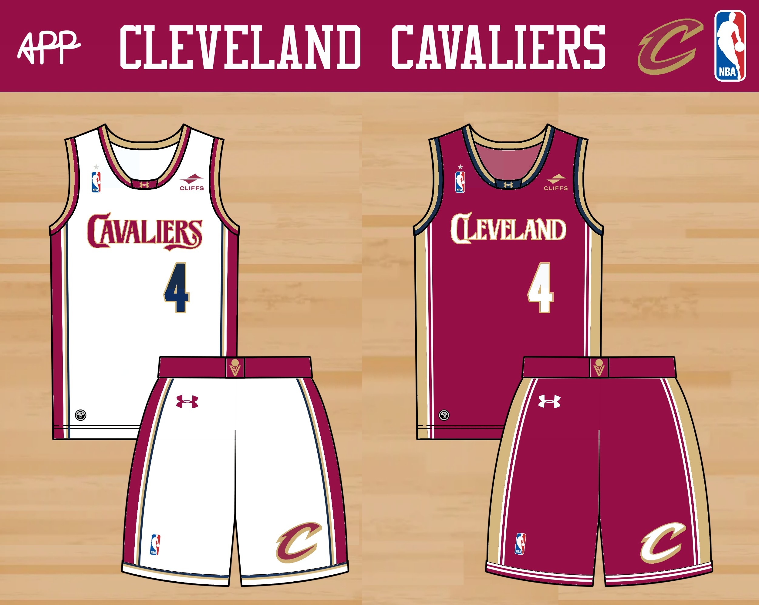
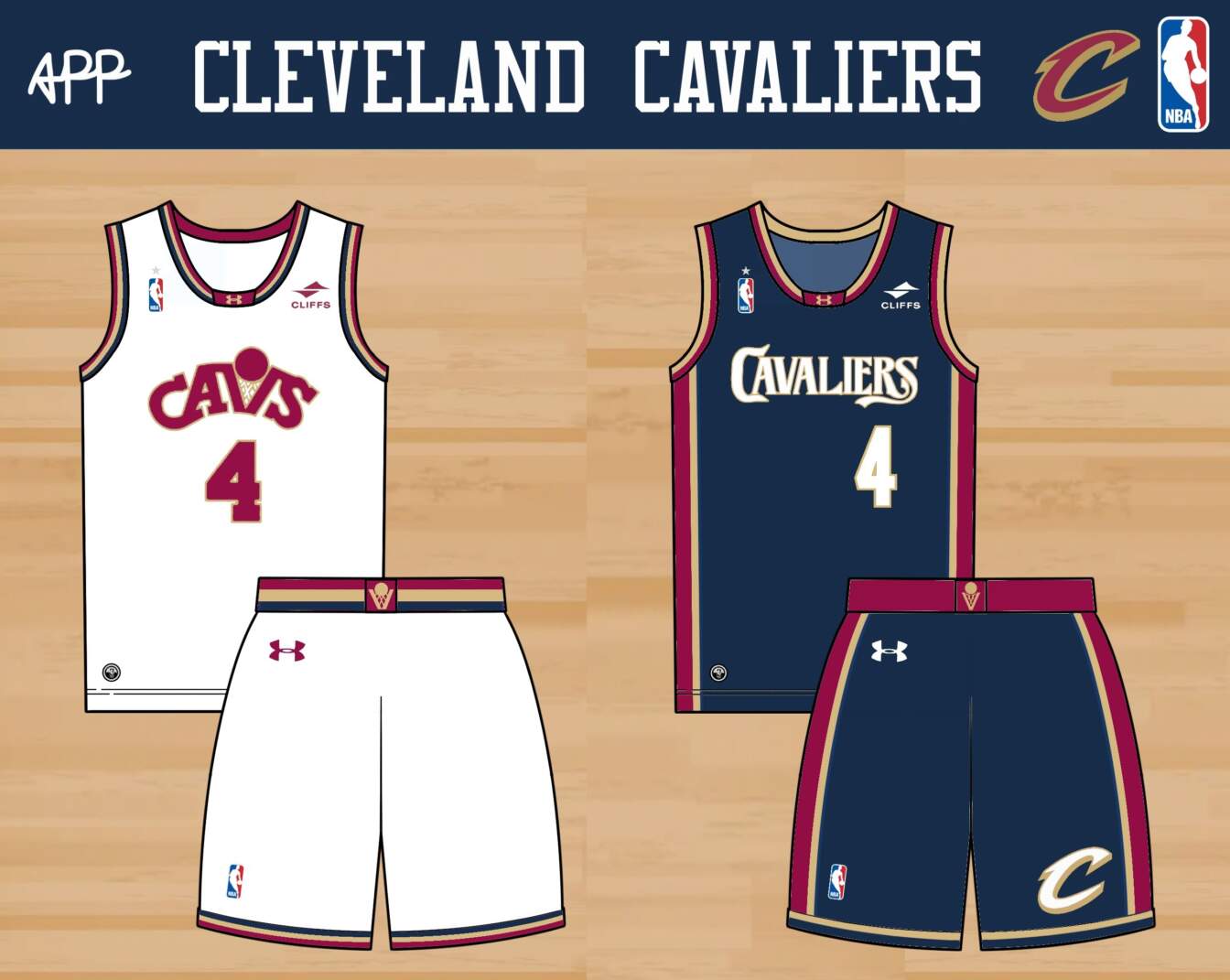
One of my first memories from moving to the US was the huge LeBron James ‘Got Milk’ posters in my elementary school cafeteria, with the deep red and gold jersey he wore. The Cavaliers have had a lot of jerseys before and after that 2000s set, but none have had that same swagger as that set. I cleaned up that set a bit here and there, and updated the wordmark, drawing from the typography on a 1970s cover of ‘The Three Musketeers’. The home alternate is a Retro Refresh of the early ’90s Cavs jerseys, while the away alternate is a revival of the popular navy jersey from the first LeBron era.
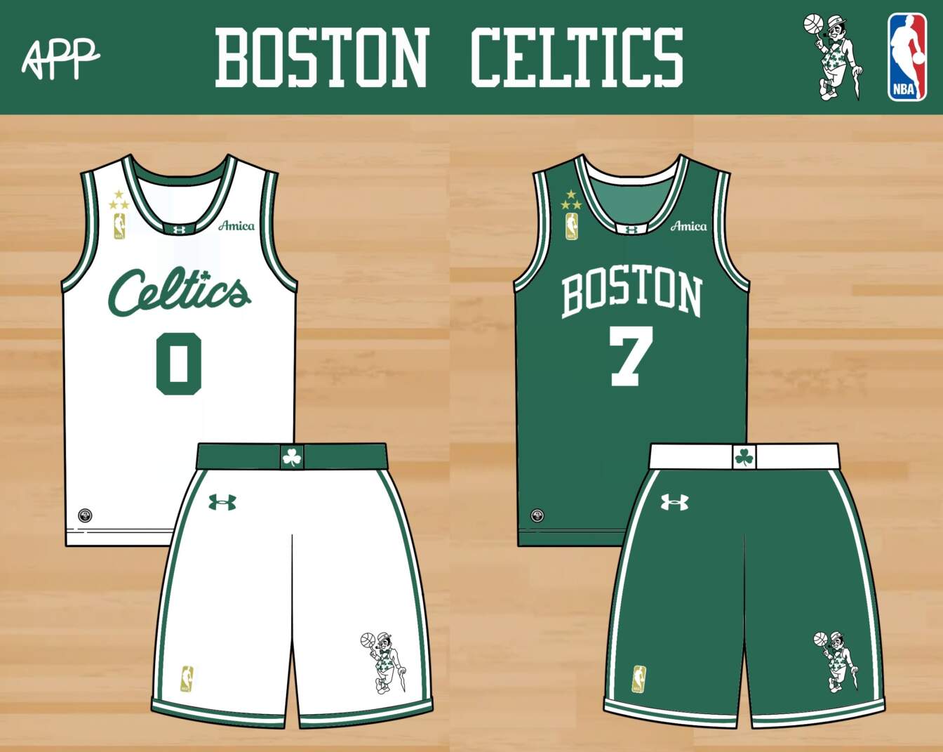

As champions, the Celtics get gold NBA logos, along with 3 gold stars, one each for every five of their titles. Whisper it, but the Celtics’ white jerseys are a little boring… I updated them with the script wordmark from a recent City Connect, and added a redrawn Lucky on the shorts. In my mind, the Celtics wear a darker, more sophisticated green, so I carried that over across these. The home alt is a Retro Refresh of their 1950s look in cream, while the away is a new take on their popular black alternate jerseys. Some teams look cool in a black jersey sometimes, ok?
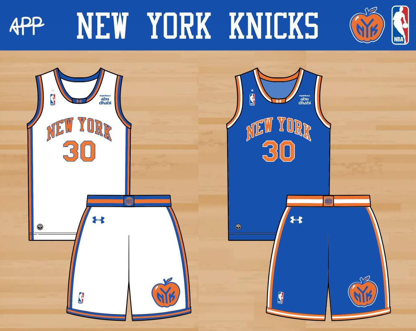
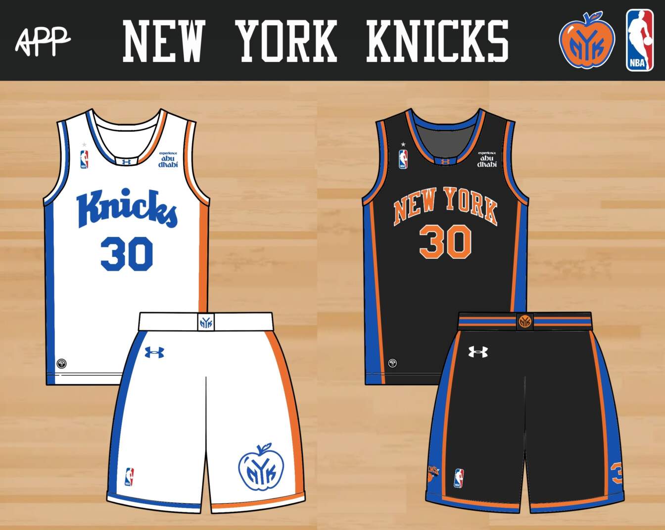
The big change here is the new logo. I redesigned the early ’80s big apple logo for the current day, and to avoid a trademark dispute with the Yankees. I think hats with this thing would sell like crazy. The home and away get some updated striping, and the big apple on the shorts. The home alternate is inspired by the New York flag and tricolor soccer jerseys (see here and here), with a wordmark from a prototype Knicks logo from the ’90s. The away alternate is a Retro Refresh of the late ’90s Knicks jersey, this time in black. I know I’m breaking my own rule again by adding a black jersey, but come on, you can just imagine Charles Oakley throwing elbows in this thing.
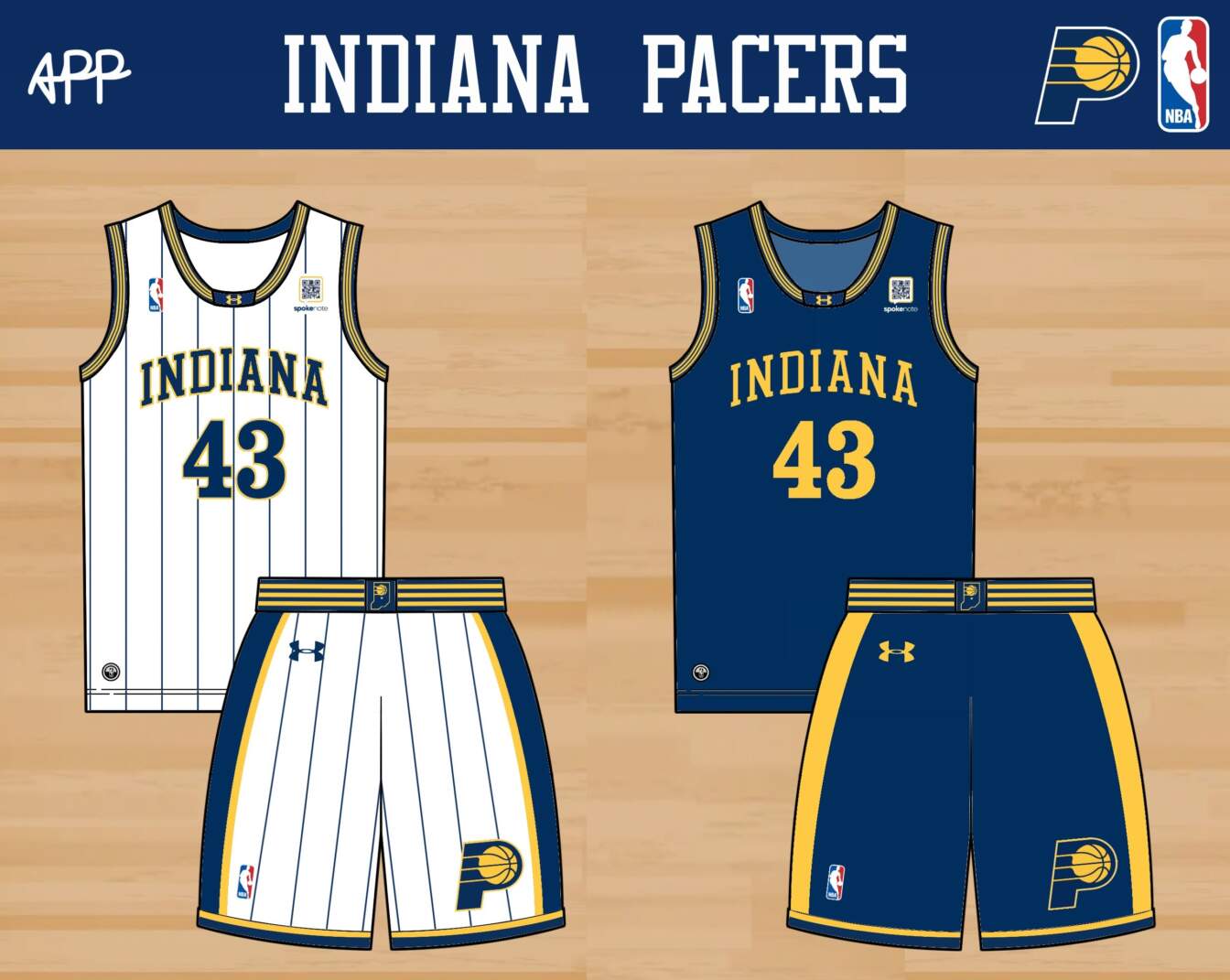

The Pacers have an interesting uniform history- they looked super ’70s in the ’70s, super ’80s in the ’80s, super early ’90s in the early ’90s, you get the idea… When I think of them though, I imagine them wearing something more ‘Malicious.’ I updated the ‘Malice at the Palace’ set with three stripes to mimic their logo, and numbers that nod to classic IndyCar fonts. The home keeps the pinstripes, but the away and home alternate look cleaner without. The away alternate is a Retro Refresh update of their 1970s look.
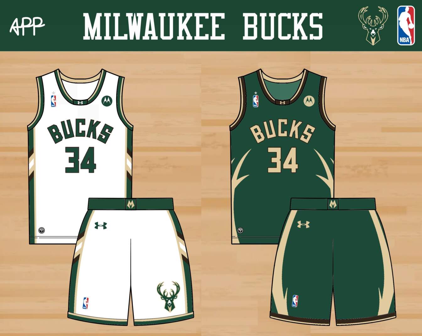
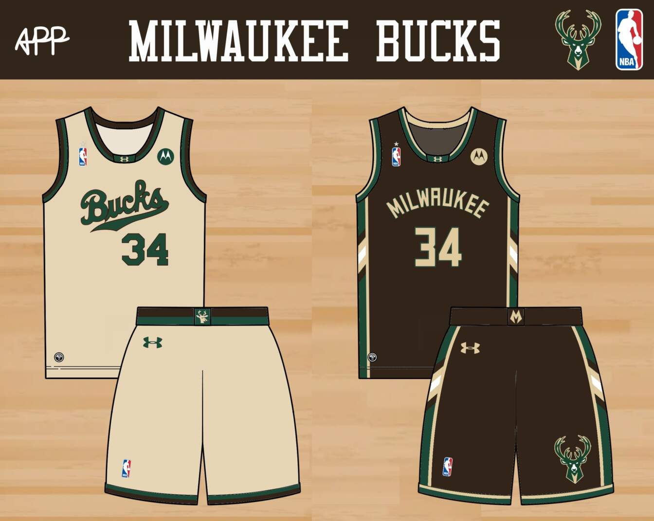
The Giannis era in Milwaukee may be coming to an end, but it doesn’t mean the jerseys and colors of the era need to be scrapped. The Bucks won a title in the green and cream, so they’re staying. The weird blue can go. The home jersey simplifies the ‘rainbow’ striping and angled panels of their current set. The away builds on the antlers theme that has been carried through a few of their recent alternates. One thing I started to appreciate as I made these was how the curve of the antlers flows directly into the curve of the wordmark… Anyway, the home alternate is a Retro Refresh of a fun ’70s look, while the away alternate is a recolor of the home jersey.
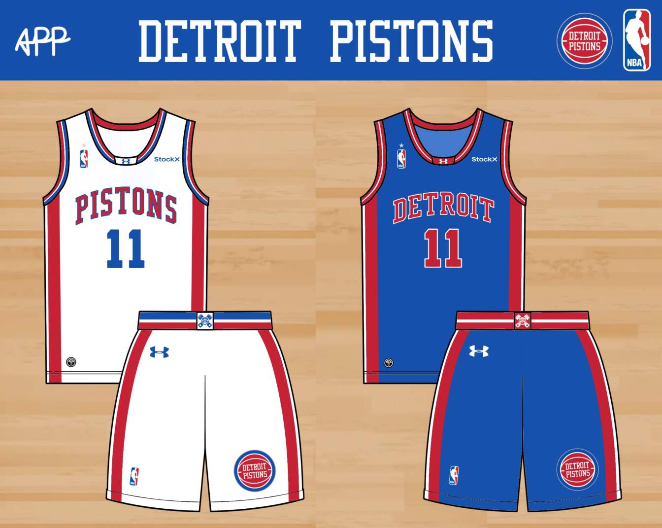

The Pistons are a classic team that deserve a classic jersey. I drew on the ’70s and ’80s with the block fonts and collar trim on the home and away. The Pistons ’90s jersey is one of my favorites ever; it would have been perfect for almost any other team, or in any other context. I had to bring it back, in blue and red, as the home alternate. The away alternate is just a recolor of the away, giving the Pistons a much-needed return to a red jersey. I use their excellent e-sports logo on the shorts.
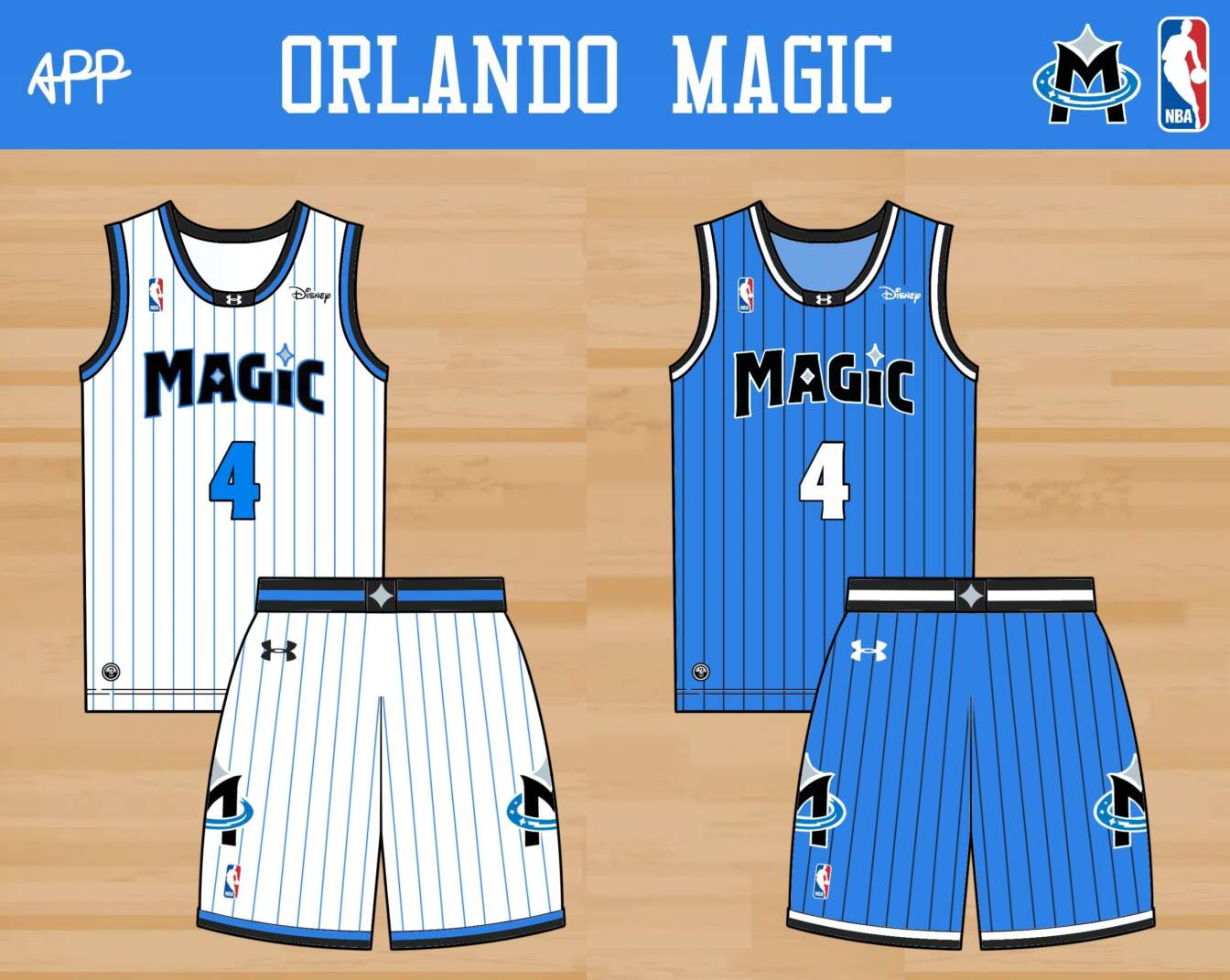
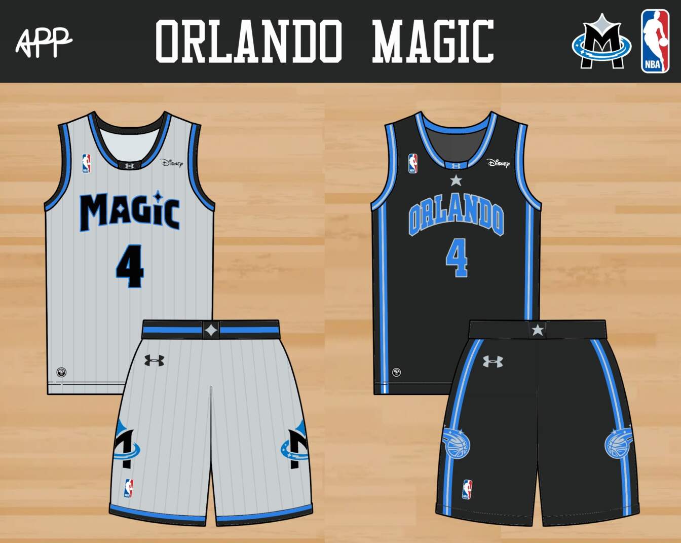
I made an entirely new logo for the Magic, since they haven’t had a really solid one, ever. This logo introduces a hypocycloid star that is carried through the jerseys, along with a bold ‘M’ and a hidden ‘O’ in a magic sweep inspired by Fantasia. I apply the new logo and a new wordmark to the home and away jerseys, which are heavily influenced by the Magic’s awesome early ’90s look. The home alternate is a more sober look in light silver, while the away alternate tries to make their boring early 2000s jerseys more interesting with a recolor inspired by the Detroit Lions’ alternate jerseys.
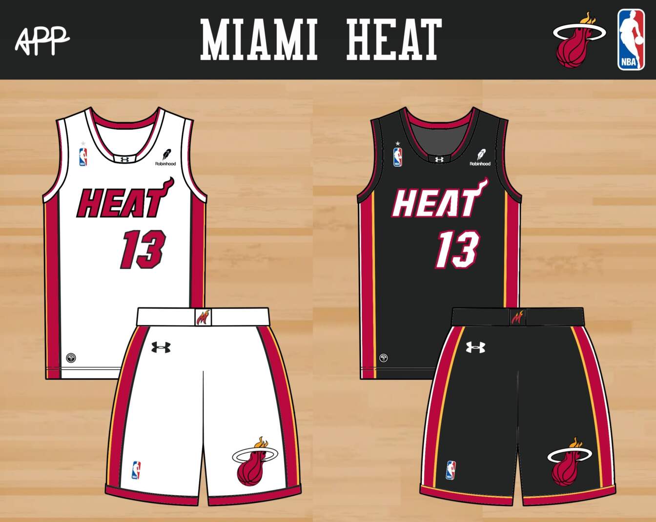
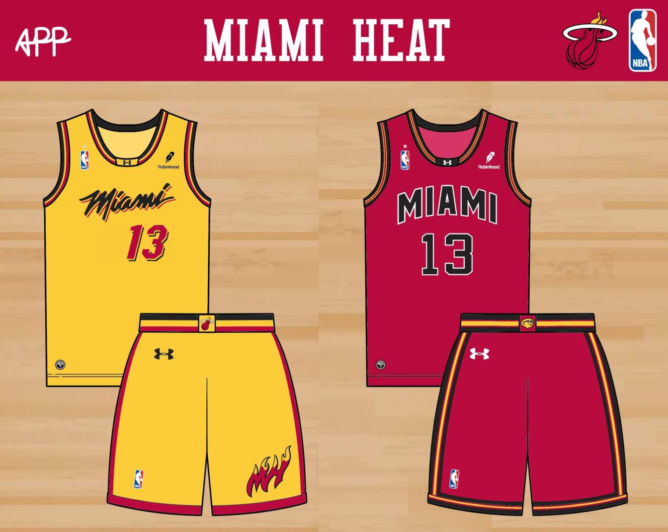
Hear me out – the Miami Heat may have the most perfect home and away set in the NBA. Even things that shouldn’t work about them, like the uneven distribution of red and black across them, works perfectly. The Vice is fun now and then, but these are classics. I was more creative on the alternates. The gold home alternate builds on the script and patterns from the Vice jerseys. The away alternate is a Retro Refresh based on the first-ever look of the Miami Floridians, repainted in red. I incorporated their weird logo in the waistband, so I can imagine fans calling these the ‘Lemonheads jerseys’.
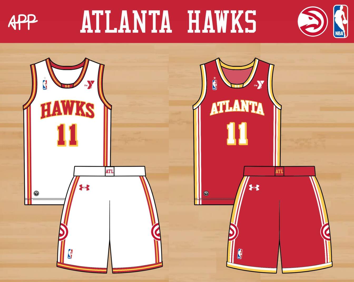
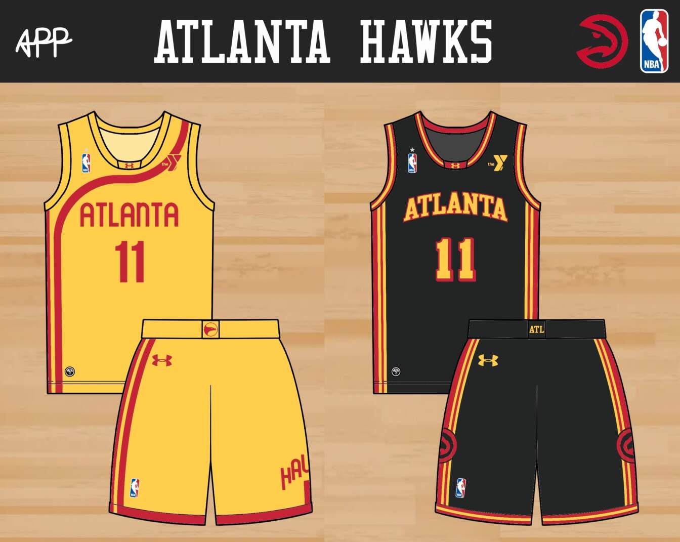
I like what the Hawks are cooking in Atlanta. They took a surprise swing at a retro look, and I think it works for them. The home, away, and black away alternate (the coolest in the set) get only minor striping simplifications. The home alternate is a Retro Refresh of the Pete Maravich jerseys from the 70s.
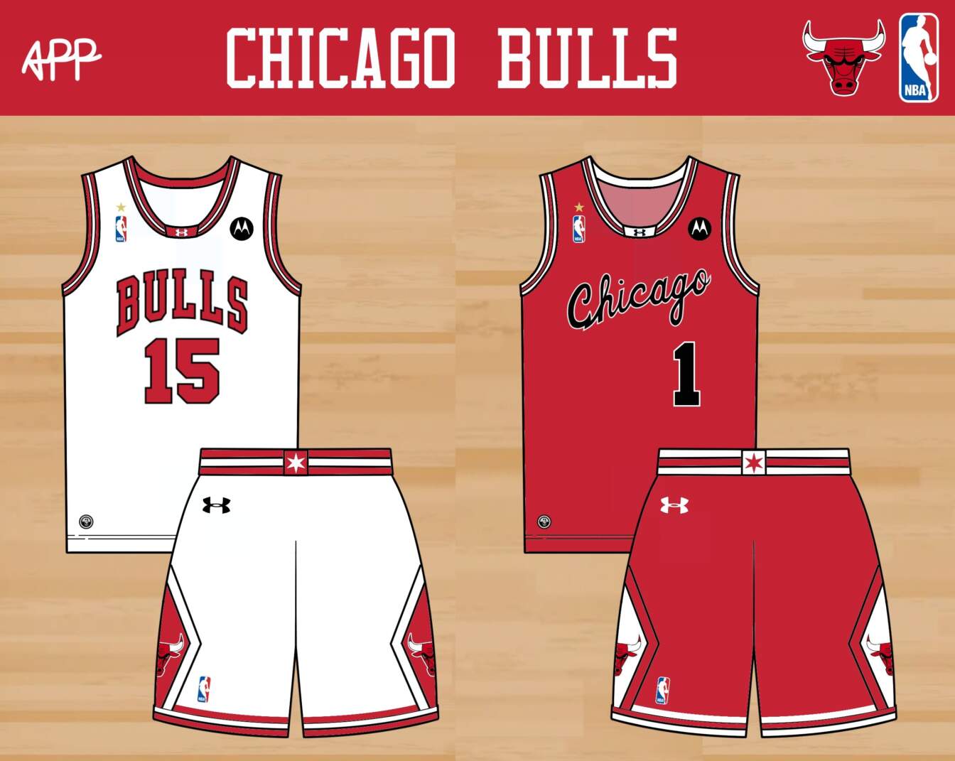
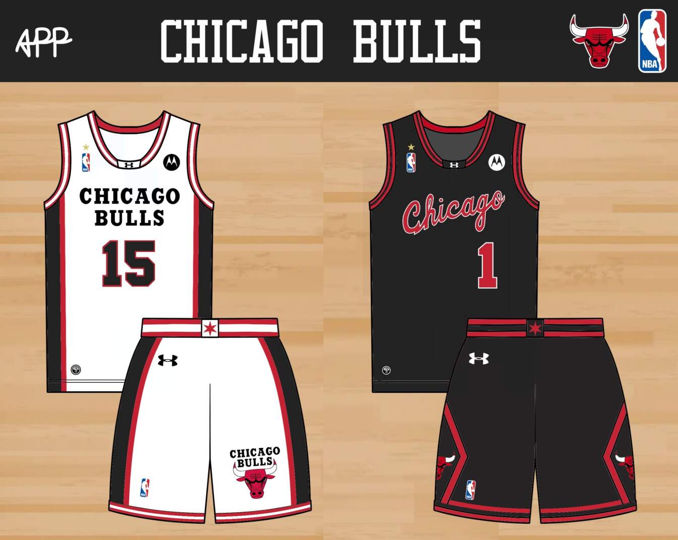
This is another close to untouchable set, with one exception. I’ve always preferred the script Chicago Bulls jerseys, as seen on a young Michael Jordan. Maybe it’s because of the laptop sticker I had as a teenager. The script Chicago goes on the away and the updated black away alternate jerseys. For the home alternate, I was drawing a blank on a Retro Refresh, until I saw the Bulls’ clean 1990s warmup jackets. That formed the basis of this jersey, which also showcases the funky font that only appears on their logos.
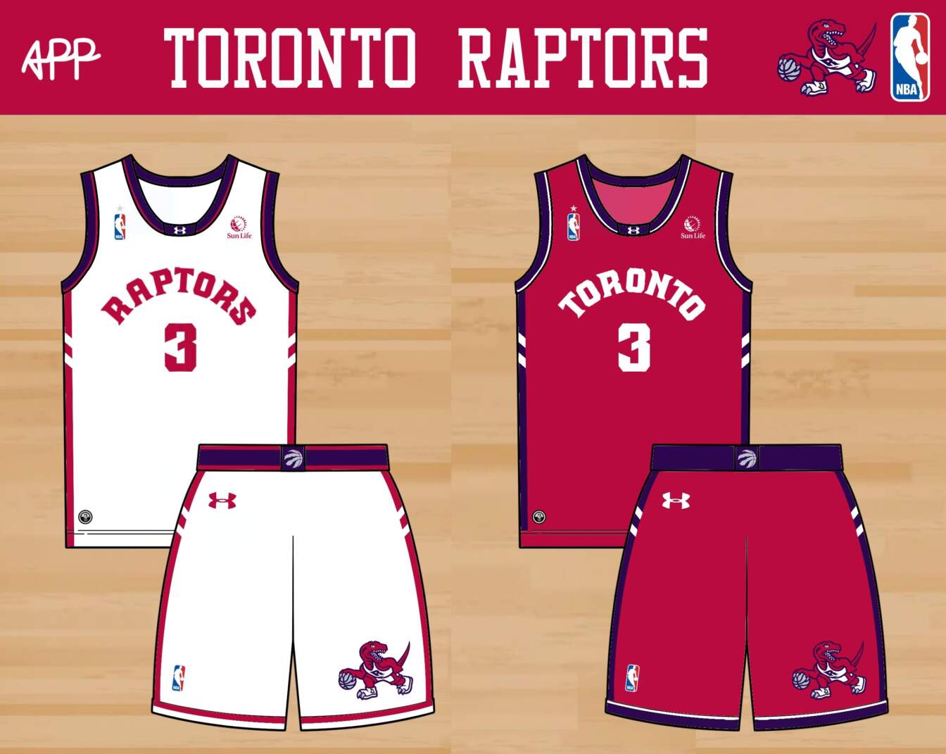
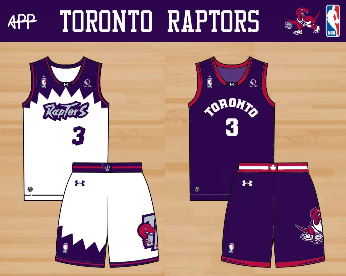
This is one of my favorite sets I did for this series. For the colors, the Raptors go with a deeper red and a dark plum purple, splitting the difference between their ’90s purple and black. The jerseys draw on the ones worn in the most iconic moment in Raptors history, Kawhi’s shot against the 76ers. I tried to inject some character with type and numbers inspired from their ’90s logo. The home alternate is another one inspired by a warmup jacket, making for a wilder jersey to complement the more sober home and away. The purple away alternate has striping inspired by the tail of the raptor in the logo, and a proud Canadian flag tribute on the waistband.
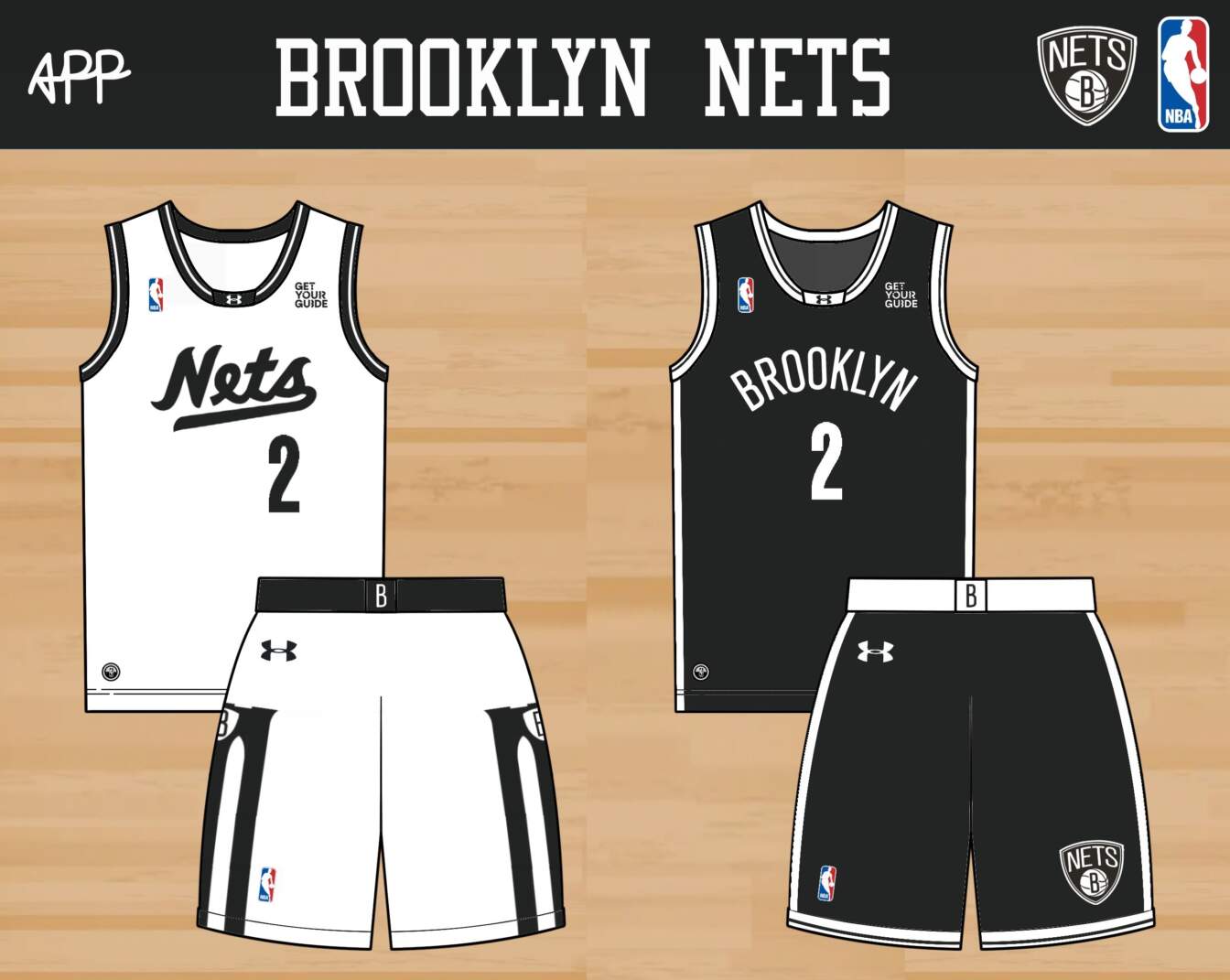
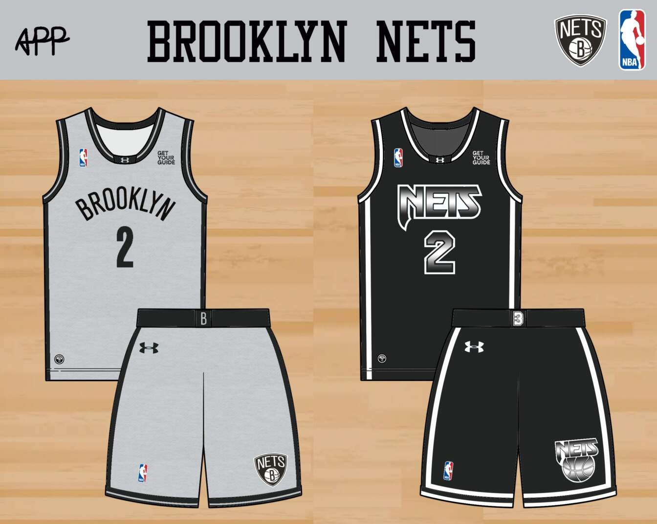
The Nets’ black jersey is a borderline classic, and goes basically unchanged here. Their white jersey has always looked a bit ‘blank page’ to me, so I updated it with a script inspired by their early ’70s look, and a bold shorts design inspired by the Brooklyn Bridge. The grey home alternate is inspired by a jersey they wore a while ago, which was itself inspired by Jackie Robinson’s Brooklyn Dodgers jersey. To make that connection clearer, I added a vintage heathered texture. The away alternate is inspired by their ’90s look, with the gradient from the logo applied to the wordmark to create something that looks pretty metal.
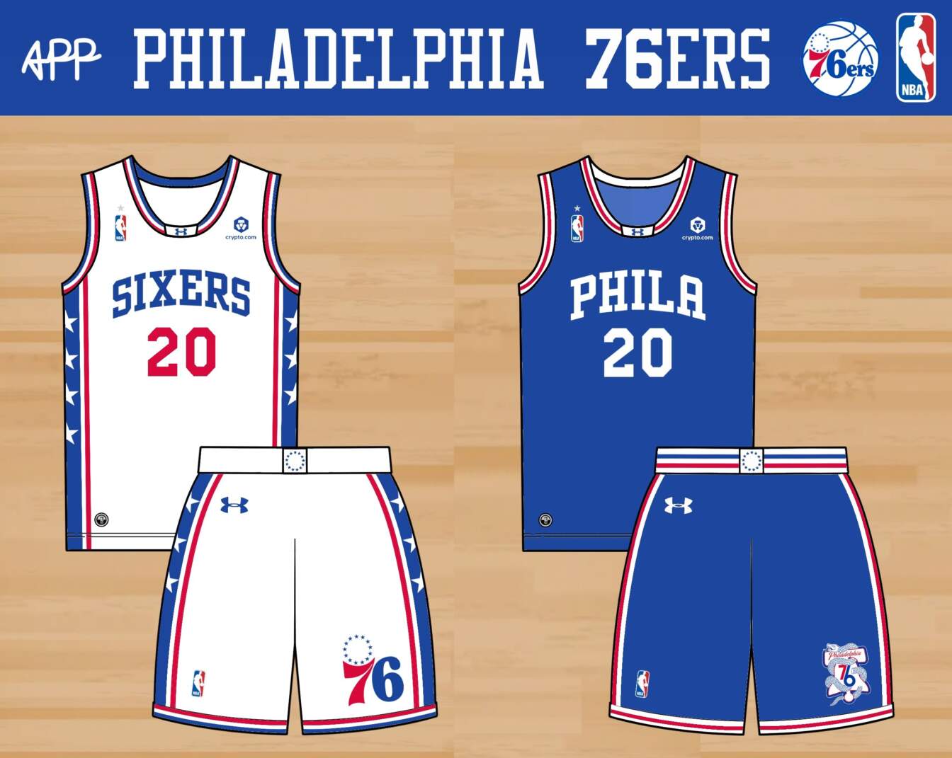
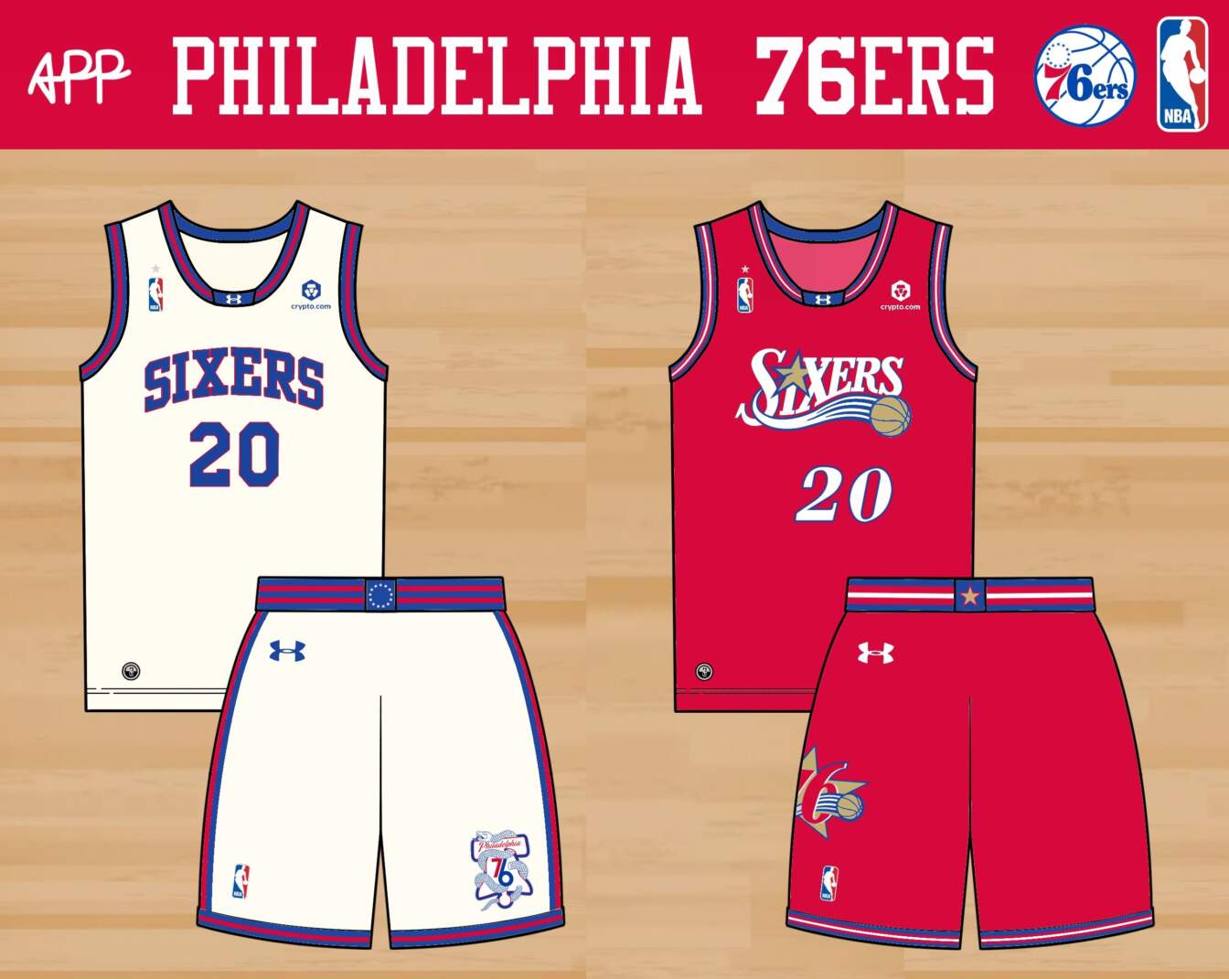
The Sixers have had more different great jerseys and logos than any other team in the NBA. I could have drawn from the Allen Iverson and Dr. J eras here, or their Rocky Balboa or ’70s-inspired city editions. I’m disgusted that I didn’t make room for their dribbling Ben Franklin logo. The home jersey barely changes. On the away, I went for a Wilt Chamberlain tribute, with their excellent snake logo. The home alternate repeats this design in cream, inspired by a Phillies alternate I love. The away alternate brings back the Iverson-era design, this time in red, white, and blue.
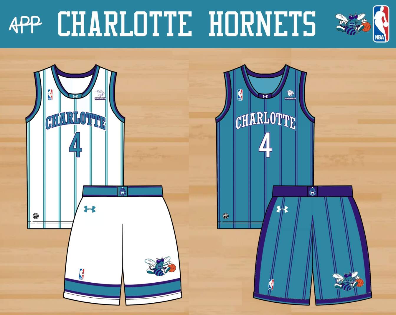
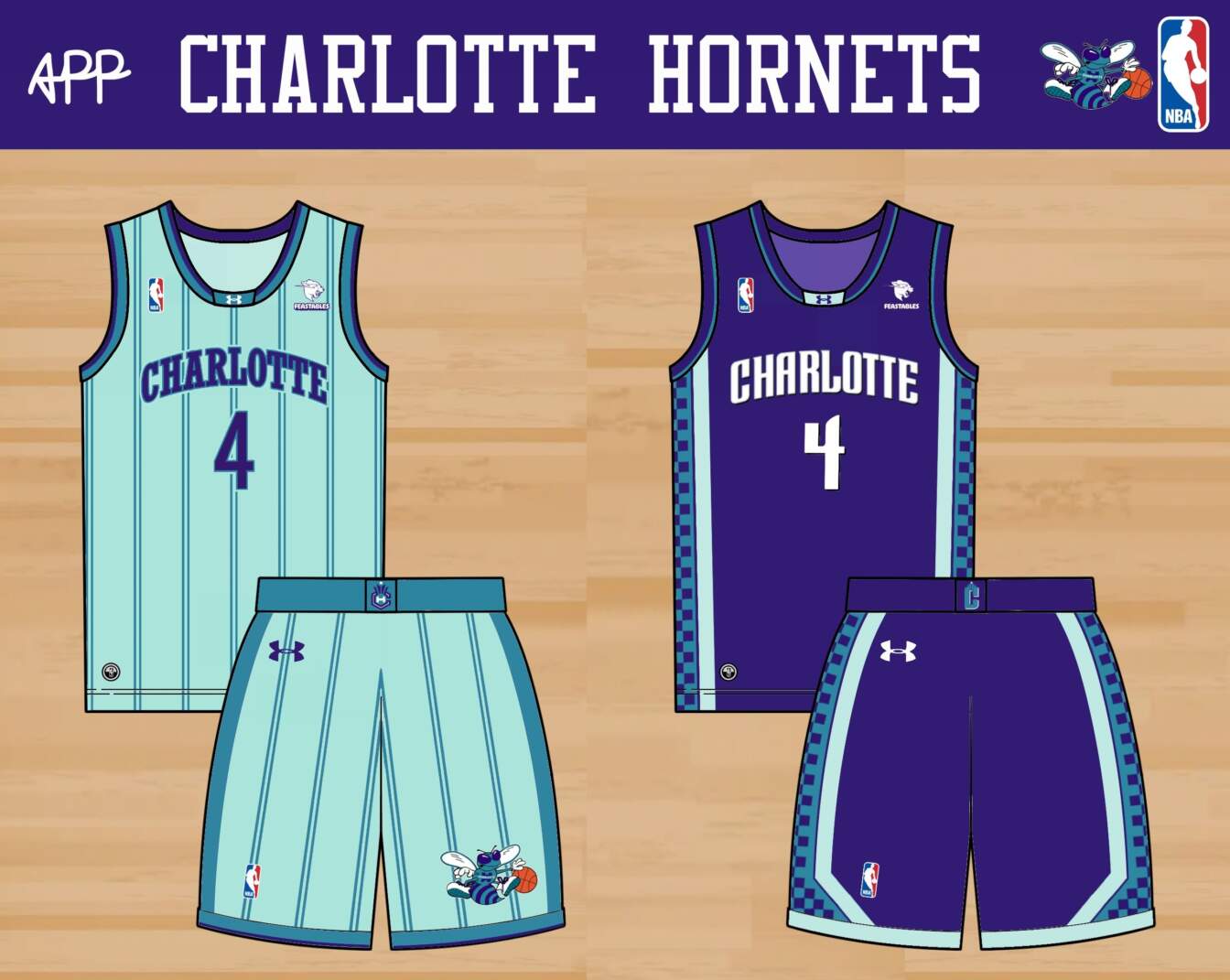
In recent years, the Hornets have experimented with a mint color that works so well that I’ve promoted it to their main set. For their home jersey, I was inspired by classic Hornets jerseys from the ’80s, along with the striping on the current Seattle Sounders jersey. The away is more standard, and the home alternate repeats that design, but in mint. The away alternate takes on a famously ugly Bobcats jersey, though I think the design really sings when rendered in purple, teal, and mint.
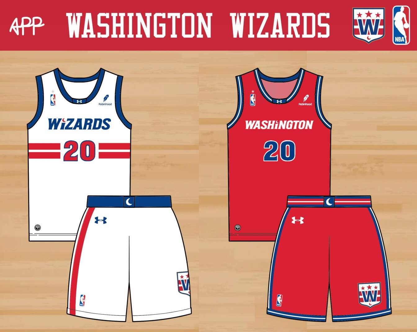
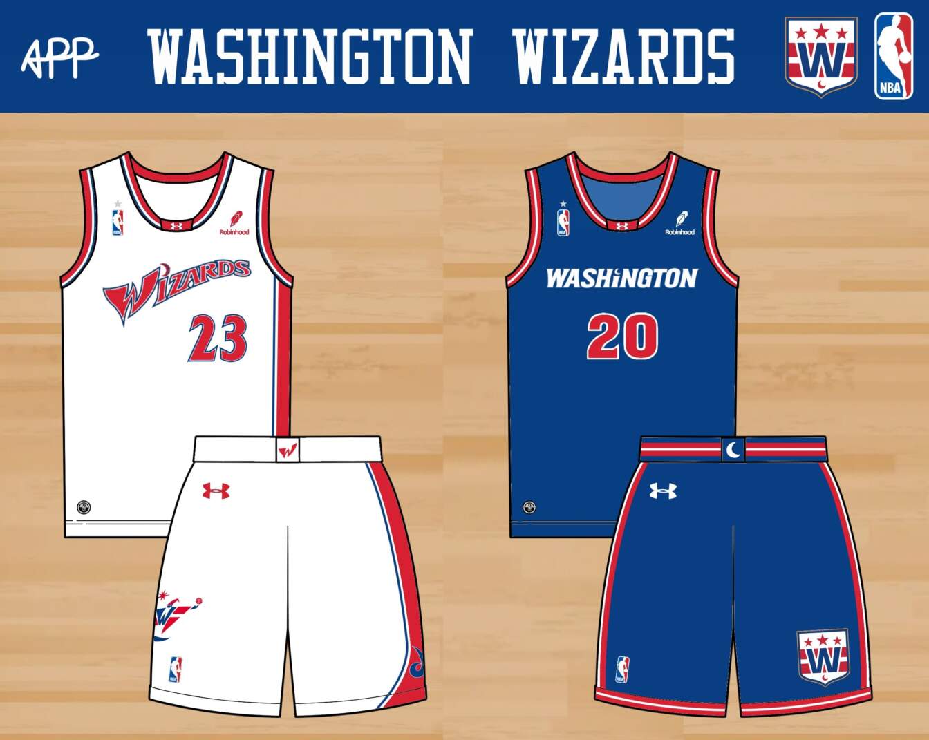
I started here with a new logo, which combines the Washington flag design of their current logo with vaguely ‘magical’ touches like a crescent moon and a shield shape. The home jersey repeats the flag motif, also echoing the stripey Bullets jerseys of the past. The away jersey is more inspired by the cleaner ’90s jerseys. The crescent is incorporated into the script on both. The home alternate is a Retro Refresh nod to the Michael Jordan era in red, white, and blue, while the away alternate is a simple recolor of the away jersey.
Readers? What say you?
Guess the Game from the Scoreboard

Guess The Game…
…From The Scoreboard
Today’s scoreboard comes from Rodney Jameson.
The premise of the game (GTGFTS) is simple: I’ll post a scoreboard and you guys simply identify the game depicted. In the past, I don’t know if I’ve ever completely stumped you (some are easier than others).
Here’s the Scoreboard. In the comments below, try to identify the game (date and location, as well as final score). If anything noteworthy occurred during the game, please add that in (and if you were AT the game, well bonus points for you!):
Please continue sending these in! You’re welcome to send me any scoreboard photos (with answers please), and I’ll keep running them.
Guess the Game from the Uniform

Based on the suggestion of long-time reader/contributor Jimmy Corcoran, we’ve introduced a new “game” on Uni Watch, which is similar to the popular “Guess the Game from the Scoreboard” (GTGFTS), only this one asked readers to identify the game based on the uniforms worn by teams.
Like GTGFTS, readers will be asked to guess the date, location and final score of the game from the clues provided in the photo. Sometimes the game should be somewhat easy to ascertain, while in other instances, it might be quite difficult. There will usually be a visual clue (something odd or unique to one or both of the uniforms) that will make a positive identification of one and only one game possible. Other times, there may be something significant about the game in question, like the last time a particular uniform was ever worn (one of Jimmy’s original suggestions). It’s up to YOU to figure out the game and date.
Today’s GTGFTU comes from James Tallion.
Good luck and please post your guess/answer in the comments below.
link


