Miami Heat Unveil New 2024-25 City Edition Uniform



The Miami Heat have released their new 2024-25 City Edition uniforms, and like several other NBA teams, their new uniforms follow a two year arc, as the new unis are basically a color swap from their previous CE kit, with the black and red elements being swapped for one another.
They seem to be viewing their release more as a marketing move than an explainer, as they plug their uniform store (“Shop now”) and advertiser right in the setup.
A color that has defined legendary players in legendary moments. Always in our blood, now on our backs once again.
Shop now – https://t.co/QepY7KcXNA#BleedHEATRed // @RobinhoodApp pic.twitter.com/Zbiw2q3xJq
— Miami HEAT (@MiamiHEAT) November 14, 2024
The team is far from alone in apparently phoning it in, but this may be the least exciting unveiling of a CE uniform to date.
Let’s take a look at the uniform now.


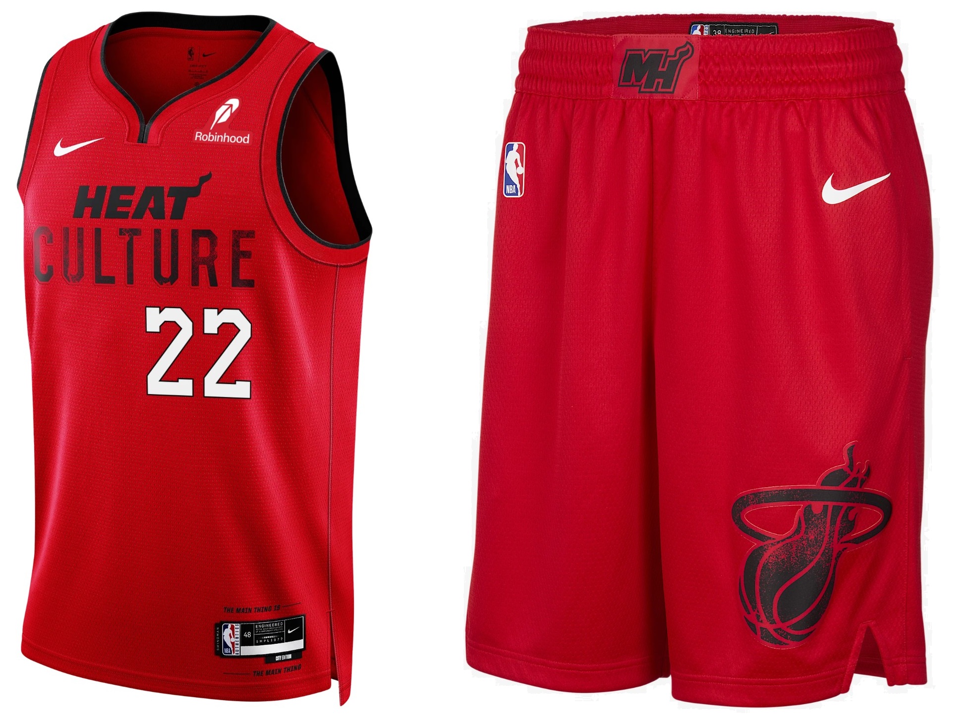

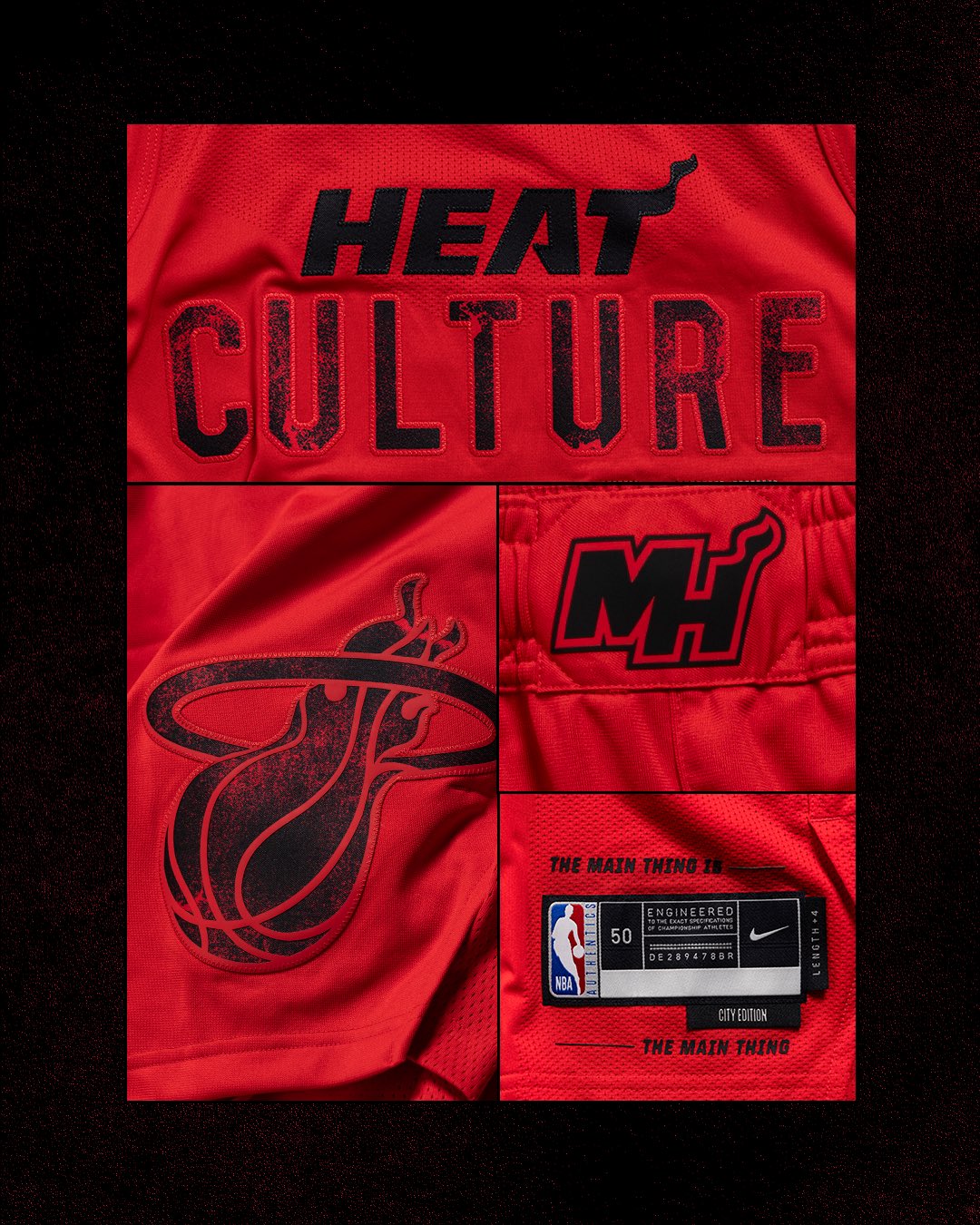
The uniform is red — very red. In fact the team is calling it their “Blood Red” uniform. It’s not only very red, but there’s not really a whole lot to it. It’s mostly red, with a single thin black soutache on the neck and arm openings. The wordmark consists of the Heat’s “HEAT” logo atop “CULTURE.” Beneath that is the only non-red/black part of the uniform: the uni number is in white with at black outline.
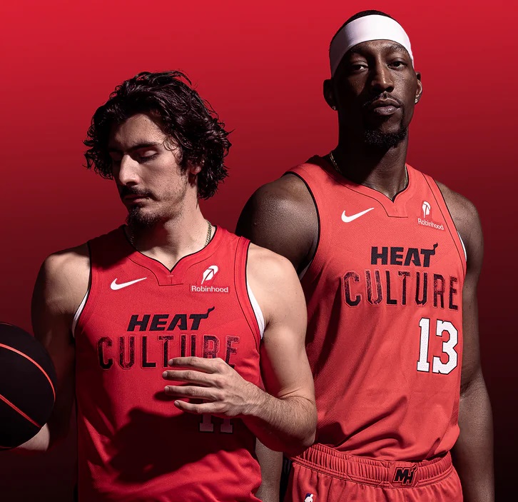

If you’re curious about the “Culture” thing, the team has provided this cringy description…
The Miami Heat 2024-25 City Edition Uniform delivers a powerful homage to the fierce spirit of Heat culture, encapsulated in a vivid ‘Blood Red’ base. Rooted in the franchise’s legacy of resilience, ambition and championship glory, this new edition reflects Miami’s unwavering commitment to “Bleed Heat Red.” With its striking design, it honors not only Pat Riley’s transformative leadership but also every historic moment that’s defined Heat basketball.
Perhaps the team didn’t feel the need to further explain that whole culture thing. For that, we need to go back to last season, when the team described it thusly: “Heat Culture is a set of core shared values, expectations, commitments, and customs that inform how Miami operates as a team and an organization. This version of the City Edition uniform serves as the embodiment of that philosophy, which maintains the standard of getting 1% better every day.”
OK then.
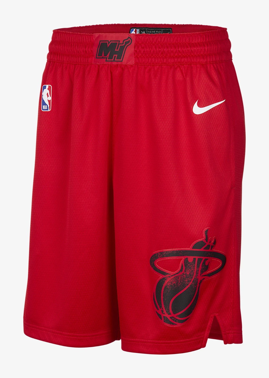
The shorts are as plain as the jersey. They feature a simple “MH” logo on the waistband, with the team’s flaming ball-through-hoop logo on the left pants leg.

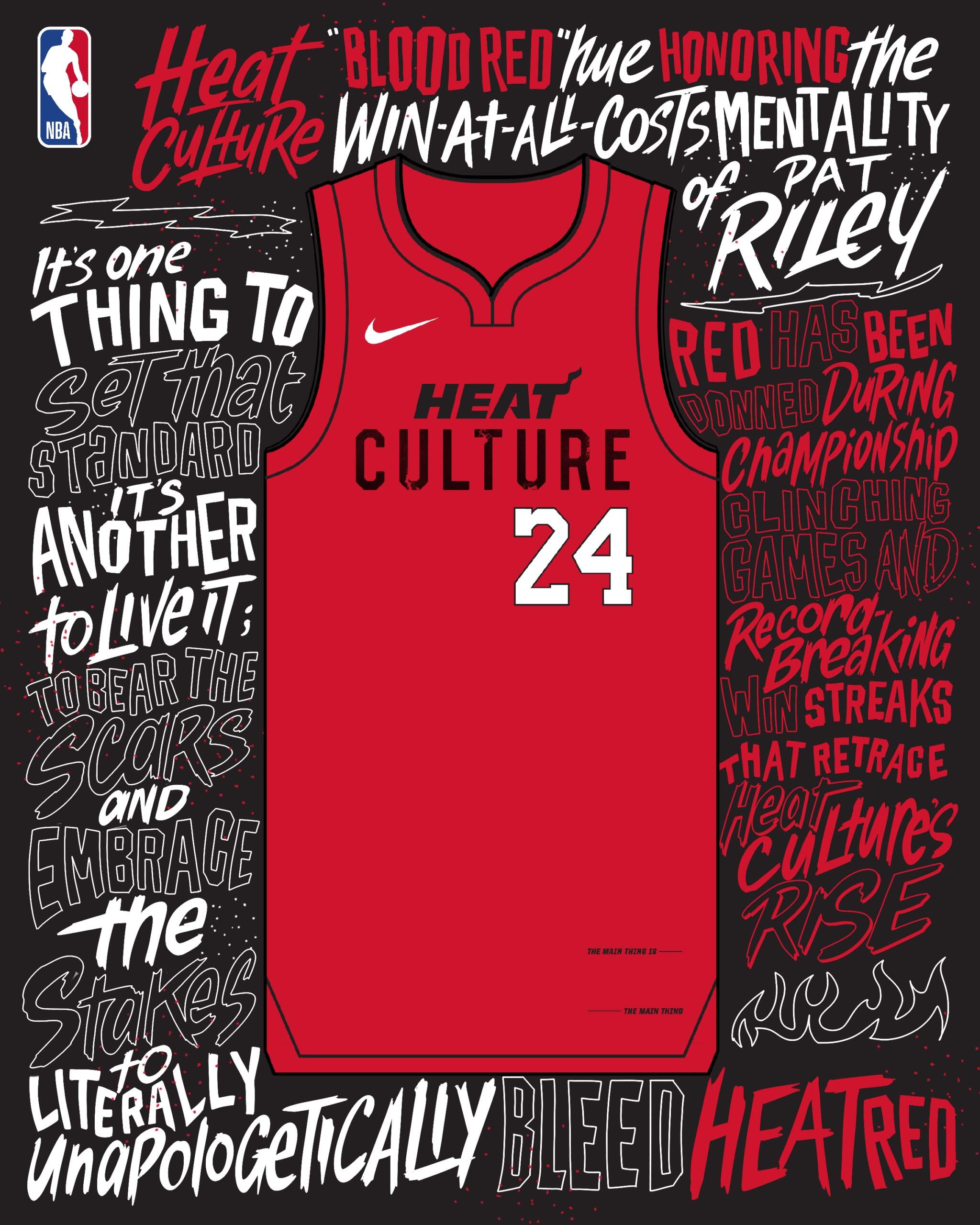
On a social media post, the Heat weren’t shy about the apparent lack of effort put into the new CE: “A color flip of the 2023-24 ‘Heat Culture’ jersey, the Miami Heat’s 2024-25 Nike NBA City Edition Jersey retains all the elements of its predecessor, save for the base color: a ‘Blood Red’ hue honoring the transformative, win-at-all-costs mentality of HEAT Culture’s architect, Pat Riley.”

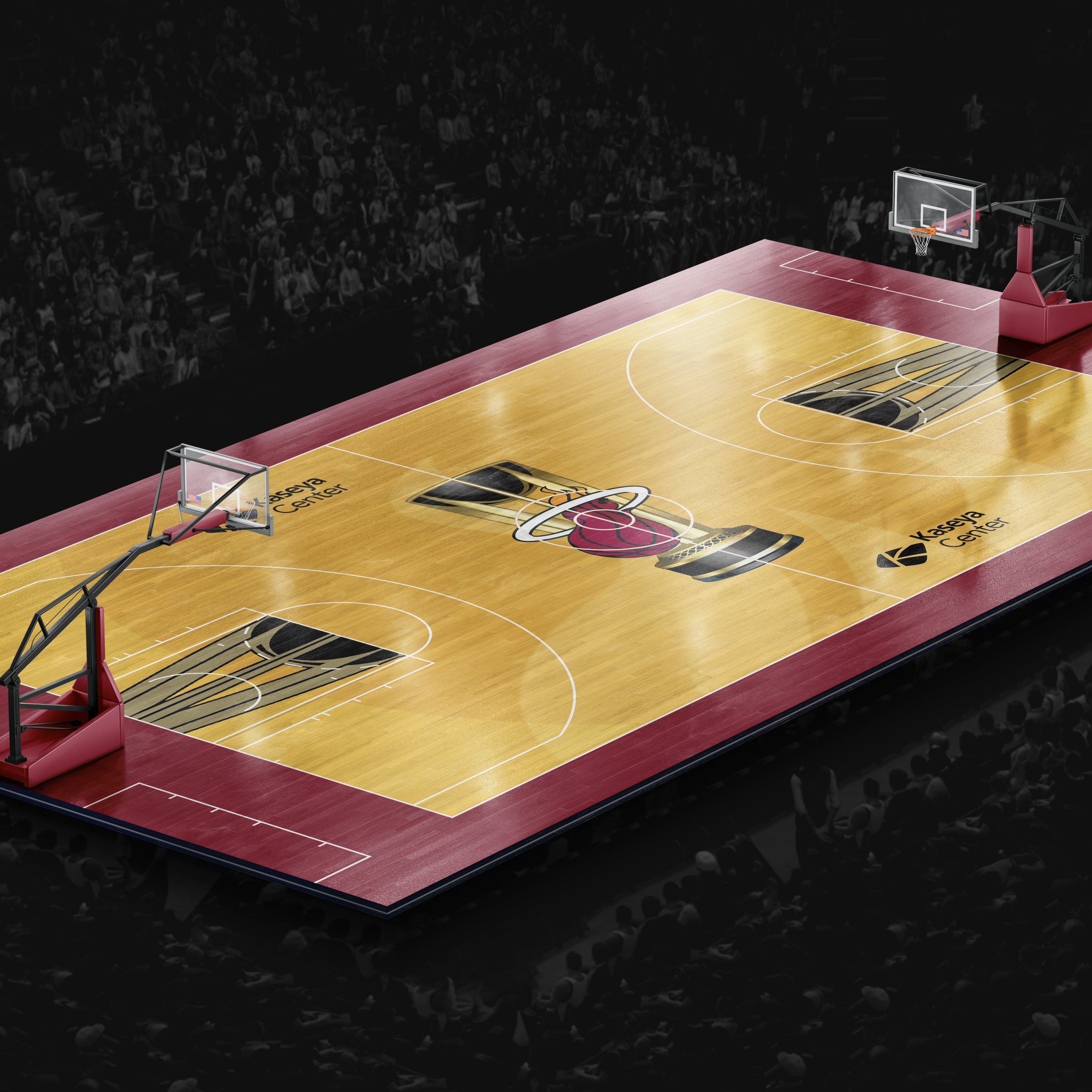
There will be a special court on which the CE uniforms will be worn.

Here is a look at all the “features” of the new uni.

I don’t want to single out the Heat for their lameness, but this is probably the worst of all this year’s CE uniforms (and that’s saying something). I searched the Interwebs for almost an hour trying to find out when the uniform would be debuted, but found nothing. I’m not going to critique the “Heat Culture” thing, and I was always a fan of Pat Riley, but even that feels forced. It’s a shame too, because I LOVED most of the Heat’s previous City Edition jerseys (running the gamut of “Miami Vice” color combos from white to black to blue, although that story arc finally got played out when they moved to a gradient. Those (excepting the gradient) were AWESOME uniforms, and I almost wish they had made those their regular home, road and alternate unis. But this “Heat Culture” — especially spanning two years — feels like the designers kinda gave up after a nice run.
Your thoughts?
link


