
Greg Seher’s NFL Uniform Concepts and Tweaks (NFC West Edition)
")
Long-time reader and submitter Greg Seher (who recently had submitted concepts for the NHL and NCAA) has returned, this time with some concepts and tweaks for the NFL. Today is the final set of Greg’s NFL tweaks. Here are the concepts previously posted:
AFC East
AFC North
AFC South
AFC West
NFC East
NFC North
NFC South
Today we’ll look at Greg’s concepts for the NFC West. Enjoy!
by Greg Seher
Some uniform basics that are league wide:
1. I’d get rid of the free for all of alternate uniforms. Go with standard dark home and white away uniforms (aside from hot weather white at home exceptions). I’d give each team a dark and white throwback option, and all teams wear throwbacks once a year on Thanksgiving. For a few teams I’d give them fauxback exceptions instead of true throwbacks when needed.
2. The large college style chest wordmarks don’t look right, but I do like the small wordmarks below the collar, these are being added to all the teams.
3. No logos on the back collar of jerseys, that’s a bad trend, if you want to put a maker’s mark somewhere maybe put it there.
NFC West
ARIZONA CARDINALS
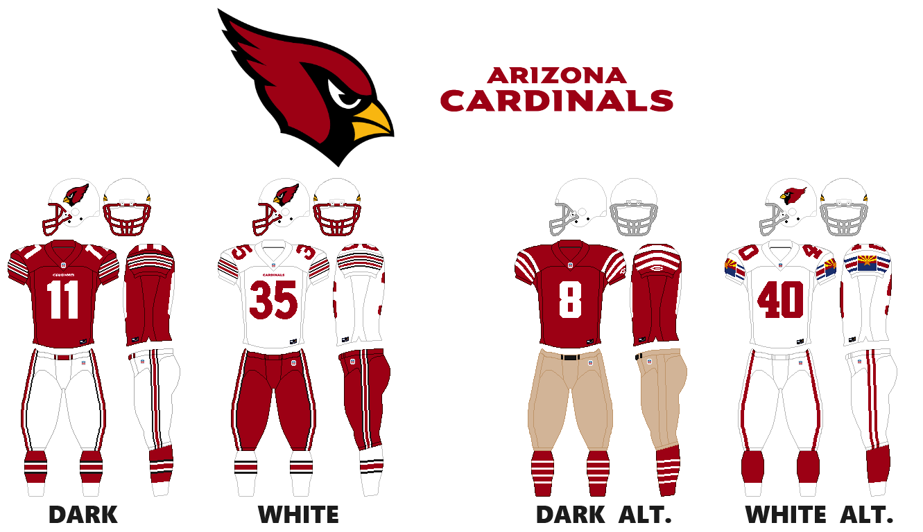
I changed it up to something simple and traditional, using their stripe pattern from their St Louis years’ white jersey, with a custom number font. Their white throwback is just going back to the design used in 1996 with the Arizona flag. The dark throwback is a modification of the 1925 championship season, to meet modern uniform specs, sort of like what they did for the 75th season throwbacks.
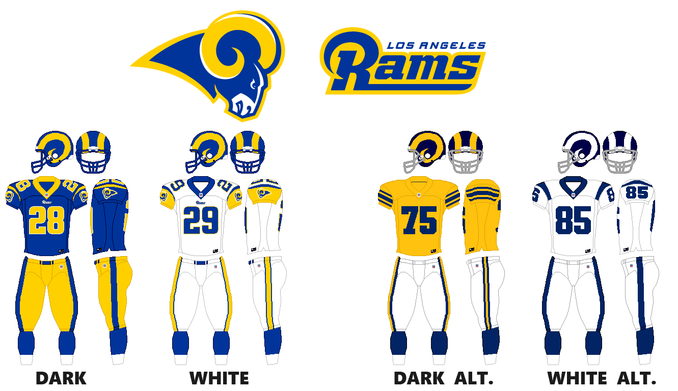
I like their navy and gold design from the St Louis days, but think the bright blue and yellow works better than navy and gold, so swap the colors and I think it’s a great look. The 1951 championship season yellow throwback with navy helmet is a good alternate look, as well as the 1960s white horn design.
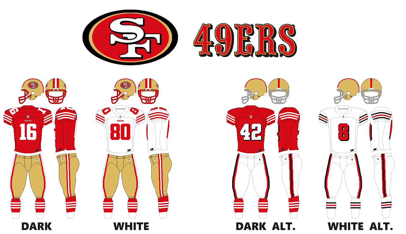
Mostly just switching the the red facemask and brining back stripes to the socks. For the throwbacks, using the fauxback design they have now, but since the design it was based on in 1955 had a plain red helmet, using a plain gold helmet instead.
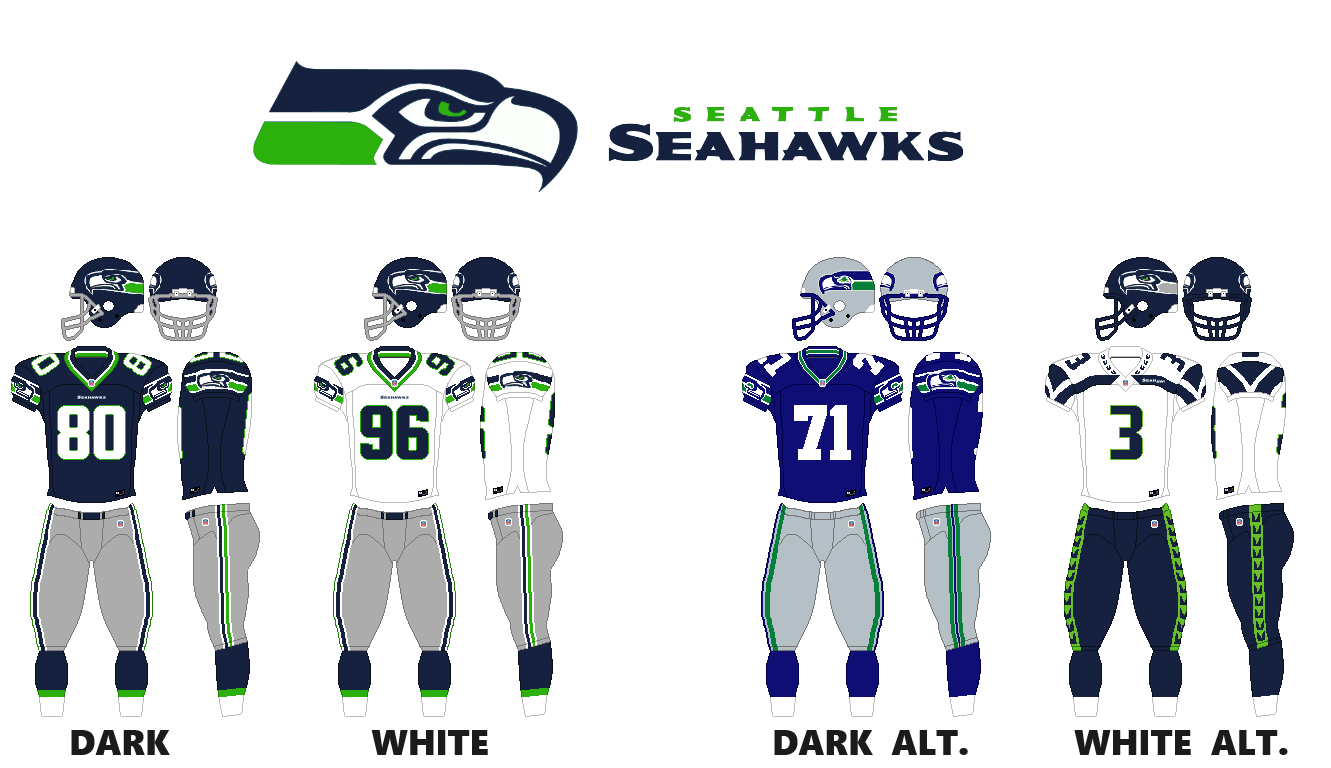
Ditching the all navy look, going with the gray pants with both dark and light jerseys. Thought the logo and uniform could focus more on the bright green a little more. I’m not a fan of all the weird stripes they’ve got going on the chest, and especially not the word mark on side instead of the center, asymmetry in uniforms drives me nuts. So cut out all weird stripes, and go with a more traditional look, since their classic look was classic for a reason. The alternates an obvious choice to throwback to the classic blue and silver design from the 1980s and 1990s, and then using their 2013 championship season design.
Thanks, Greg! And thanks for sharing the entire NFL series!
Readers? What say you?
link


